Baymax in CSS
February 18, 2015
Let's use CSS to create the Baymax character from the movie Big Hero 6.
In this post we'll be animating a background image, as well as a subtle animation timing effect, and make a CSS demo out of one single HTML element.
You can see it full screen here.
Single element
By making use of pseudo-elements, we'll be able to create the face parts using one HTML element.
<div class="baymax"></div>Styling
To set the stage we'll add a subtle gradient to the screen to make it look like a curved, white head. For this we'll use a radial gradient on the body.
body {
  background: radial-gradient(circle at
center, #fff, #fff 50%, #aaa);
  background-size: 100% 100%;
  background-repeat: no-repeat;
  height: 100vh;
}
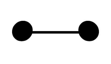
Next we position the face in the centre of the page. The mouth is a simple black line, and we'll create that using a border.
.baymax {
  border-bottom: 1.5em solid #000;
  position: absolute;
  top: 50%;
  left: 50%;
  width: 50%;
  transform: translate(-50%, -40%);
}
The first property sets a black border of width 1.5em. It then positions the line using absolute positioning, pushing it down 50% and across from the left 50%. These 50% values relate to the size of the container (body) element.
The problem we now have is that the element now starts halfway down and halfway across the screen. It's off center.
To offset this, we use a transform to pull the element left 50% of it's width, and up 40% of it's width.
At this stage the mouth is centered like so:
Adding the eyes
We'll make use of the before and after pseudo-elements to add eyes to the face. This won't need any extra HTML and is entirely handled by the CSS.
.baymax::before {
  background: #000;
  border-radius: 50%;
  content: "";
  position: absolute;
  width: 12em;
  height: 12em;
  left: -9em;
  top: -6em;
  transform: skewX(-4deg);
}
.baymax::after {
background: #000;
border-radius: 50%;
content: "";
position: absolute;
width: 12em;
height: 12em;
right: -9em;
top: -6em;
transform: skewX(4deg);
}Each of these pseudo-elements have a black background, and a border-radius of 50% to make them circular. Each is positioned at an end of the mouth, and lastly have a skew transform to make them look like they're tilted back a little. The result should look like this:
Low battery
There's a funny scene in the movie where Baymax's battery runs low. He staggers around and his eyelids droop. We can use a combination of background gradients and animation to create the effect.
First we want to give the background two colours. Black for the part of the eye that's open, and white for the eyelid. The white part needs to be positioned outside the eyes at first, then we will animate it in to make the eyelids droop.
.baymax::before {
  background: linear-gradient(to bottom, #efefef, #efefef 50%, #000 50%, #000);
  background-position: 0 -100%;
  background-size: 200% 200%;
  ...
}
.baymax::after {
background: linear-gradient(to bottom, #efefef, #efefef 50%, #000 50%, #000);
background-position: 0 -100%;
background-size: 200% 200%;
...
}We're adding a background linear gradient, made it twice the height of the container, and then position it so that the top half is outside the container.
With the two background gradients in place, we can add animation keyframes to control the eyelids movement.
@keyframes blink {
  0%, 50% {
    background-position: 0 100%;
  }
  85%, 95% {
    background-position: 0 75%;
  }
  100% {
    background-position: 0 100%;
  }
}
Animation keyframes are a way of describing a series of frames, using a percentage. The percentage relates to how long the animation has gone on for. So a percentage of 50% means half-way through the animation.
In this way we can set the background to stay up till half-way through, then between 50% and 85%, it moves down, and then snaps back at the end of the animation.
The next step is to tell the pseudo-elements to use these animation keyframes. Add the animation property to the existing styles.
.baymax::before {
  animation: blink 6s infinite;
  ...
}
.baymax::after {
animation: blink 6s 0.1s infinite;
...
}Here we've told the browser to use the blink animation on each element. The animation duration is set to six seconds and will loop infinitely.
One extra property is in the second example. The 0.1s after the 6s tells the browser to delay that animation by 0.1 seconds. This creates the effect of the second eye closing slightly later than the first. It adds to the tired, droopy effect and makes it look a little more human. The end result should look like this:
You can see the effect full screen.
Browsers
In the code examples, I've omitted any of the usual -webkit and -moz prefixes. The transform and animation properties should be prefixed, and I'd recommend using something like Autoprefixer for this.
Shareable gif version
Here's an animated gif version you can more easily share online.

Make sure to follow on Twitter for all the latest updates!