Twitter's "fave" animation
January 17, 2015
Twitter recently updated the design of their “fave” (also known as “fav”) button, introducing a new animation. Rather than rely on CSS transitions, the animation makes use of a series of images. Here’s how to recreate the animation using the CSS animation steps timing function.
Update: Heart
The following technique can also be used with the new “Heart” animation, as it’s handled in a similar way:
See the live example on CodePen.
Illusion of movement
The effect is similar to the old Zoetrope devices, which presented a series of illustrations in sequence around a cylinder. Instead of a cylinder, we display a flat series of images inside an element.
Demo
Hover the star to see the animation:
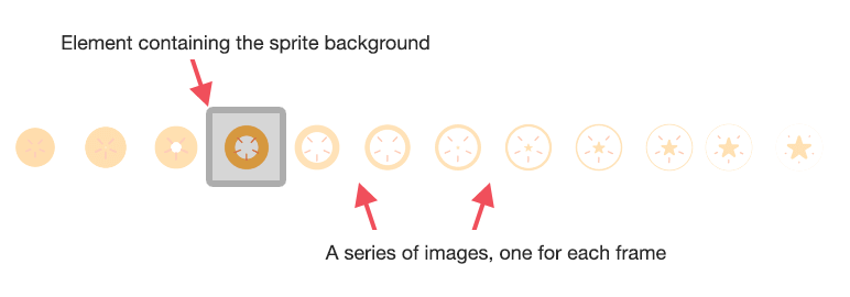
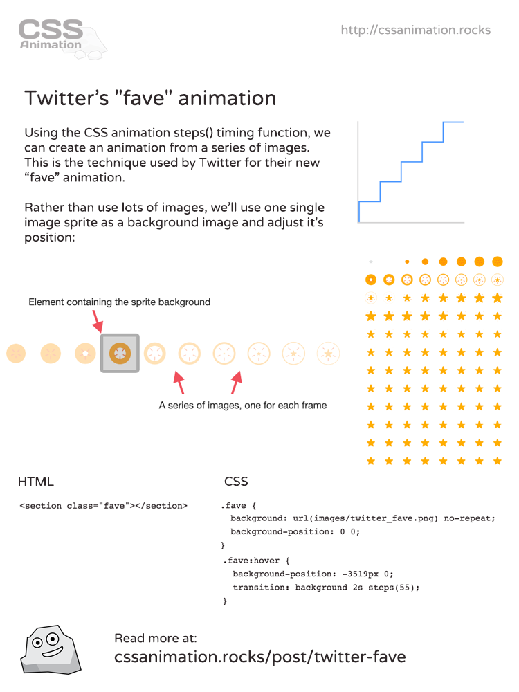
In this example we begin by creating a series of images that will make up the animation. In this case we are using part of the image set from Twitter’s fave icon animation:
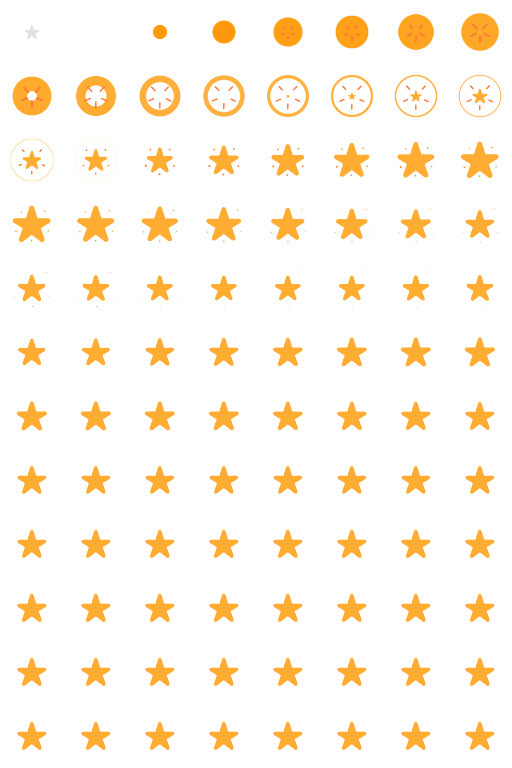
To animate these frames, we’ll need to put them into a single line. This file has them in a single row, which means we can transition from the first frame to the last frame by positioning the background:
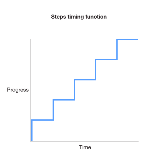
Steps() timing function
With most timing functions such as ease or cubic-bezier, the transition animates smoothly between the start and end states. The steps timing function is different. Instead of a smooth transition, it divides up the transition into a number of steps and moves sharply between each step.
To begin we set up the HTML:
<section class="fave"></section>
Background image
With that in place we can add a little styling and position the background image:

.fave {
  width: 70px;
  height: 50px;
  background: url(images/twitter_fave.png) no-repeat;
  background-position: 0 0;
}
The hover state is added, which is when we specify that the background position be moved to the end of the series of images:
.fave:hover {
  background-position: -3519px 0;
  transition: background 1s steps(55);
}
Note the second rule, specifying the transition. In this case we want to transition the background property, run the transition for a duration of one second, make use of the steps timing function. The steps part includes the value 55, as there are 55 frames in the animation.
The effect is that when we hover over the element, it jumps through the transition in 55 equal steps.
Why not a gif?
Animated gifs could potentially be used but in this case would not be a great fit. The file size is generally worse and frame rate is difficult to control. With this method we can pause, rewind, or make all sorts of other adjustments to the animation using CSS.
Other uses of “steps()”
Animating background sprites is just one use of the steps timing function. Anything that needs to be animated in a series of discrete steps is a good fit for it. You could use it to create a ticking clock for example.
Cheatsheet
If you enjoyed this article, you can share it on Twitter or save this handy summary cheatsheet:

Make sure to follow on Twitter for all the latest updates!