Animating your hero header
March 12, 2017
If you've ever arrived on a website and been greeted by a large image or video, and some titles on top, then you've encountered the "Hero Header". It's a popular way to introduce a website, and can be a great opportunity to help people quickly understand what it is your site does.
For many visitors it'll be their first impression of your brand, so you'll want to make the most of this moment to shine.
Here's what we'll be putting together.
See the Pen Landing page with animated foreground elements (staggered and cubic bezier and wedge).
Standing out from the rest
We can use animation to add polish to that first moment when the content appears, as well as use it to control the order in which information appears and draw the eye to what matters.
In this tutorial we'll animate in the content on top, and take the opportunity to experiment more with bouncy timing functions, animation choreography and creating reusable sets of keyframes.
Introducing the titles
Here's what we're starting with.
It's got a nice background image, some titles and a bit call-to-action button.
See the Pen Landing page with background image.
Making it bounce
Like in the choreography you see in stage performances and dances, we're going to think about how all the various pieces of content in our hero header move together. We could have the elements slide in to place like the background image, which would show a nice connectedness between the elements. Let's also take it a little further by making each of the elements seem to pop out of the screen.
To begin we'll create some keyframes for the animation. Within the keyframes container, we want "0%" and "100%" frames, representing the beginning and end states of the animation.
@keyframes pop-in {
  0% {
    opacity: 0;
    transform: translateY(-4rem) scale(.8);
  }
  100% {
    opacity: 1;
    transform: none;
  }
}
Initially the content will be invisible, so we're setting opacity to 0. We'll also use a transform to translate the position of the content up by 4em. Lastly we're adding a new transform. We're scaling the size down to 0.8 in the starting frame.
This means that when the animation starts the elements will be a little smaller, and by the end will have animated to their normal size. Let's see how we apply this to the content.
Moving the elements
We can now apply these keyframes to our content. However rather than adding an animation property to each element one at a time, let's take this opportunity to set up a reusable class for the animation. If we create a new class called animate-pop-in, we can then have this apply the animation more efficiently.
To get started, in the HTML, we add this class to each of the content items we want to animate.
... other HTML ...
<section class="header-content">
  <img class="rocky-dashed animate-pop-in" src="images/rocky-dashed.svg">
  <h1 class="header-title animate-pop-in">Your awesome landing page</h1>
  <h3 class="header-subtitle animate-pop-in">A useful start for your projects</h3>
  <p class="header-button animate-pop-in"><a href="#calls-to-action" class="button">Get started today</a></p>
</section>
... other HTML ...
We've added the animate-pop-in class to the image, headings and paragraph text. Now we can make use of that in our CSS. Here's what we add to our CSS.
.animate-pop-in {
  animation: pop-in .6s ease-out forwards;
}
This applies the animation pop-in to every element. It's making them appear with a duration of .6 seconds, and using the ease-out timing function.
Note: Hover and press "Rerun" to see the animation!
See the Pen Landing page with animated foreground elements (no bg movement + not staggered).
It's a start! But we can do better.
Choreography
Currently the content elements are popping in while the page is still blank. When we built our background animation, we made use of the animation-delay property. This meant the background waited for .5 seconds before the animation began.
Let's add some delays to our content items so that they show up after the background has started to appear.
Before we start adding delays, we set out which elements we're going to style.
.rocky-dashed {}
.header-title {}
.header-subtitle {}
.header-button {}
These 4 elements will need to appear, one at a time. Thankfully we don't need to put in the entire animation property for each, as these elements already have the animate-pop-in class. We'll just specify a delay on each one. Since the background animation takes about a second to get going, let's start these off with a delay of 1 second and increase it for each element.
.rocky-dashed {
  animation-delay: 1s;
}
.header-title {
animation-delay: 1.2s;
}.header-subtitle {
animation-delay: 1.4s;
}.header-button {
animation-delay: 1.6s;
}We also need to set these elements to be invisible on load, to avoid the flash where they're visible then they animate after a delay. Set the opacity on the "animate-pop-in" element.
.animate-pop-in {
  animation: pop-in .6s ease-out forwards;
  opacity: 0;
}
So let's see the result. We've added a delay that starts at 1 second, then each item waits a further .2 seconds before starting. When we look at the result we see the animations staggered.
See the Pen Landing page with animated foreground elements (no bg movement + staggered1).
It might just be my opinion but I reckon these seem to be appearing just a little bit late. Let's go back through and change the numbers so they start at .6s instead.
.rocky-dashed {
  animation-delay: .6s;
}
.header-title {
animation-delay: .8s;
}.header-subtitle {
animation-delay: 1s;
}.header-button {
animation-delay: 1.1s;
}On second thoughts, let's make that last item, the header-button appear a little more closely with just a .1 second gap. It should now all feel a bit tighter.
See the Pen Landing page with animated foreground elements (no bg movement + staggered2).
That's better. It's a good idea to take time to tweak things like animation delays and timing functions by eye. Sometimes an animation won't feel right and it might just be a question of messing around with the timings until it all works together.
So, now we have a staggered animation. It's looking pretty good, but the way the animation ends feels a little flat. Let's see if we can bring some life to this little animation with a more bouncy timing function.
Bounciness
Time to replace that old ease-out timing function with something more interesting. Over on Cubic-Bezier.com we'll create a curve that starts fast but then shoots right past the top and settles back to the finishing point. Place the first point on the left axis near the top to give it that fast start, then the second point above the top line. The resulting curve should be a long steep arc that tapers back at the end.
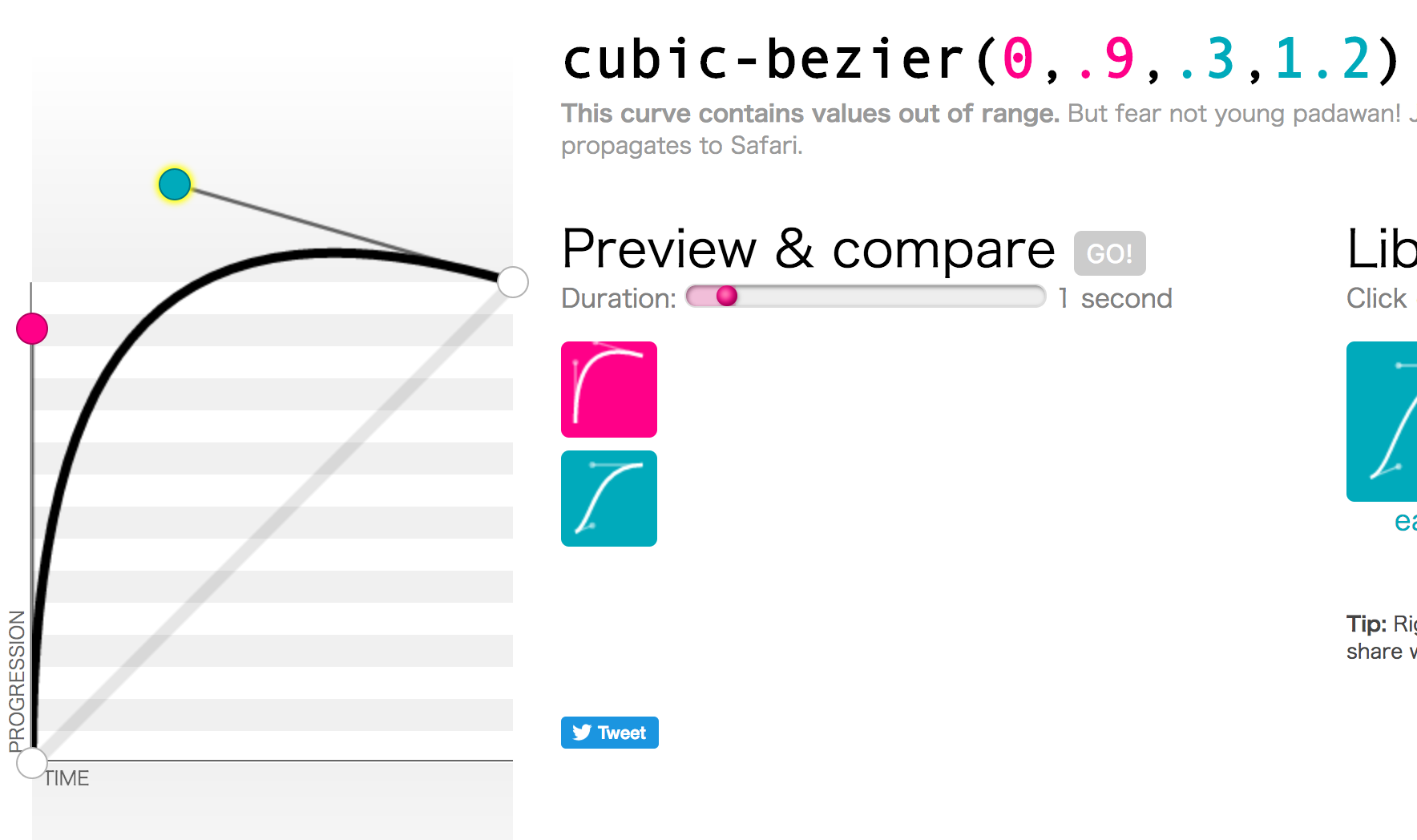
Taking the coordinates and putting them into our animation property now looks like this.
animation: pop-in .6s cubic-bezier(0, 0.9, 0.3, 1.2) forwards;Let's see how that looks.
See the Pen Landing page with animated foreground elements (no bg movement+ staggered and cubic bezier).
It's starting to look a lot better now.
Pieces working together
The purpose of this choreography is to not only to look cool, but to draw attention to what we want our visitors to see. In this case it's straightforward, we want people to see the title and then have their attention drawn to the big "call to action" button in the middle.
There's a second goal here though, and that's to let people know that there's more content further down the page. We're going to help draw attention to that using a chevron at the bottom , but we can add a subtle animation to the header also. Let's try our hand at a rotate transform by animating that big white wedge at the bottom of the screen.
Animating the wedge
As before we'll create the keyframes for this new animation.
@keyframes rotate-up {
  100% {
    transform: rotateZ(-4deg);
  }
}
You'll notice there's no "0%" this time. That's because it's optional. You can choose to leave out either the starting or even the ending keyframe and the browser will infer it based on the styles given to the element. In this case, it'll go from having no transform, to being rotated. We apply this by making a couple of changes to our header:after block.
header:after {
  animation: rotate-up .5s .5s cubic-bezier(0, 0.5, 0, 1) forwards;
  background: #F9FCFF;
  content: "";
  height: 40rem;
  left: -5%;
  position: absolute;
    right: -5%;
    top: 90%;
  transform-origin: 0 0;
  z-index: 0;
}
First we add the animation property, giving it the animation name of rotate-up. I've decided to make the duration just .5 seconds this time. If it's longer, it'll still be moving when the other content is appearing and that could confuse the flow. We'd like this to be a subtle animation that doesn't distract from the main content. We'll have it delayed for .5s and use the same timing function as the background image.
Lastly we want this to begin without any transform, so we remove that line. It should now use the rotate-up keyframes to rotate from no transform, to -4 degrees.
As a last minute bonus, I've added some animation to the background image too. Really brings it all together! Check out the result.
See the Pen Landing page with animated foreground elements (staggered and cubic bezier and wedge).
Next steps
In this tutorial we have learned how to create and apply an animation to a class of elements, then use the animation-delay property to choreograph them. We'll be able to reuse this animate-pop-in class elsewhere without adding any extra CSS code to our project, essentially making it the beginning of our own animation library.
You may have noticed the lack of scroll cue, and an issue where the image might be half-loaded when the animation starts. Don't worry, you can find these and many more answers in the full course).
Take your skills to the next level
This is part of the new course, Level Up your CSS Animation Skills. Build the ultimate animated landing page. Enrol today and save 58%!

Make sure to follow on Twitter for all the latest updates!