Mac Plus CSS
March 31, 2015
I will always remember the moment I got to use the Apple Mac Plus. In this post I will try to pay tribute to this lovely computer by creating it in CSS.
Retro style
Let's build (virtually) a computer. Not just any old computer, but a computer that was, for many of us, an introduction into the world of Apple. The Macintosh Plus, codename Mr. T, was first introduced in 1986 and packed a whopping 1MB of RAM and an 8 MHz processor. Aside from all that raw power, it was a seriously cute design, which made the computer more fun to use.
In this project I will build a 3D model of the Macintosh Plus and display it in a three dimensional setting. Using CSS Keyframe animation we'll make it move on screen to show off the 3D effect better.
Why use CSS?
With Cascading Style Sheets are the standard way to style web page content. Everything from fonts, colors, positioning and background images is handled by CSS, and it is an essential tool for making modern web pages. It's not just for two-dimensional content. With the use of 3D transforms and positioning, you can use CSS to add depth too.
Creating scenes in CSS results in smaller file sizes than images. In this example, the CSS compresses to just 4KB and the HTML less than 1KB. An equivalent image would be 100KB or more.
Live demo and source code
See the CSS Mac Plus online.
Full source code can be downloaded here, and you can view the full CSS file on Github.
You can also follow along the various stages by looking up the examples folder in the project files.
On Prefixes
I have omitted any CSS prefixes from the code examples to make the code easier to read. When working on this yourself make sure to include prefixes for the other browsers, such as the webkit, moz, ms, and o.
Setting the stage
When creating 3D using HTML we need a scene within which to build it. Start with a container HTML element:
<div class="stage"></div>This is a simple div with the class stage, and it acts as a container for our 3D object.
To establish it as a 3D container, we set some CSS properties, perspective and perspective-origin. The perspective property is similar to a scene's vanishing point. The smaller the value, the shorter the vanishing point and more extreme the effect. This image shows how changing the value changes the shape on a scene:
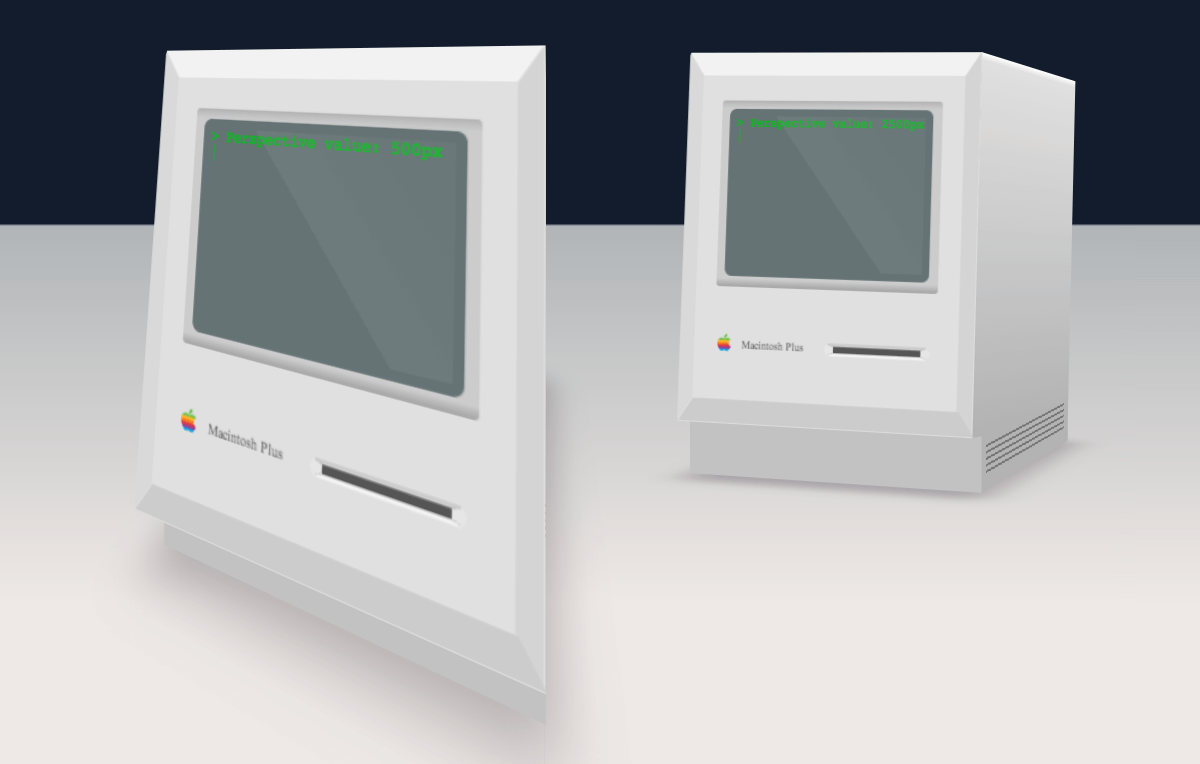
Try it yourself
If you'd like to have a go, look for the screen.css file in the examples/01-Perspective folder in the project files. You'll be able to update the perspective value and see the effect by opening the index.html file from the same folder in your browser.
The perspective-origin property sets the viewing position. Changing it allows you to look down onto the scene from above, up from below or in from the side.
In this example I've gone for a perspective value of 1,600 pixels. The CSS looks like this:
.stage {
  perspective: 1600px;
  perspective-origin: 50% 100px;
}
The stylesheets folder within the project ZIP file contains the full CSS rules for setting the various other properties on the stage, including a background, width and height.
Planning the structure
With a stage in place we'll use some HTML elements to create the computer. Rather than try to include every last detail, we'll focus on the front detailing for the most part.
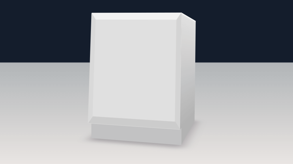
The main body of the Mac is a box, tilted slightly back at an angle and sitting on a flat base.
This will mean making two boxes, one tilted back a little and sitting on a flatter box. To create this effect, we'll make use of the CSS transform property.
If you'd like to see the full HTML, it can be found in the project files within the index.html file.
Transforms
The CSS transform property allows us to rotate, skew, position and even scale elements on the page. We can make use of the positioning and rotation to create our scene.
A transform property might look like this:
.example {
  transform: rotateY(45deg) translateZ(-100px);
}
You build a transform by chaining a series of statements. In this example, the example element is rotated 45 degrees around the Y-axis, and then pushed back 100px along the Z-axis.
It should look something like this:
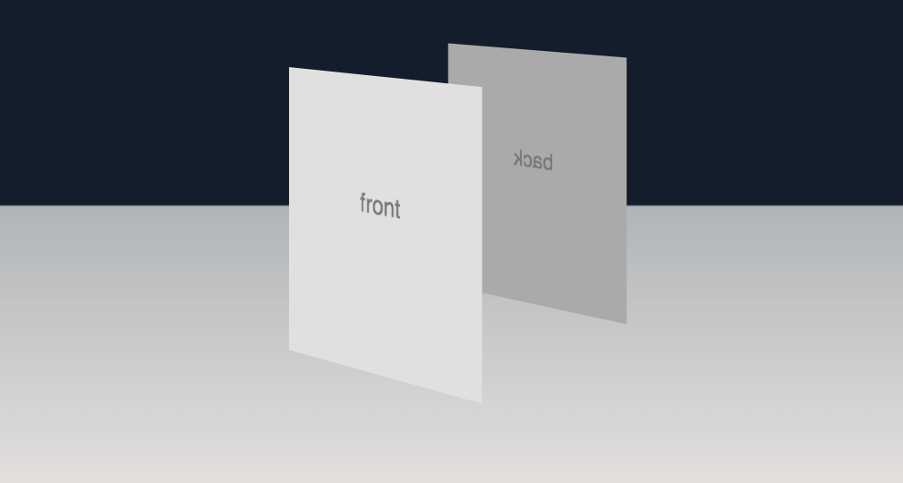
An example of CSS transforms can be found in the examples/02-Transforms folder within the project files. Two elements are positioned in the example, and their position can be changed by editing the includes 02-Transforms/css/screen.css file.
Transform-origin
When rotating elements around the place, it’s worth keeping in mind that the transforms have an origin that can be set. The transform origin is a point referred to by specifying the X, Y and Z values. This is the default:
.default-origin {
  transform-origin: 50% 50% 0;
}
When building this example I kept the default but it’s worth knowing that it’s there.
Making the boxes
We can use some transforms to set up the main body of the computer. The HTML looks like this:
<div class="stage">
  <div class="positioning animated">
    <div class="mac">
      <figure class="back"></figure>
      <figure class="left"></figure>
      <figure class="right"></figure>
      <figure class="top"></figure>
      <figure class="base-front"></figure>
      <figure class="base-left"></figure>
      <figure class="base-right"></figure>
      <figure class="base-back"></figure>
      <figure class="front"></figure>
      <figure class="shadow"></figure>
    </div>
  </div>
</div>
Within the stage, there's a div I'll use to position the computer on the page. Within that is the Mac itself. The two boxes are themselves made up of figure elements. These elements represent the sides, top, front and back of the two boxes.
There is also a figure to represent the shadow.
This example can be found in the examples/03-Boxes folder.
The result we'll be going for looks like this:
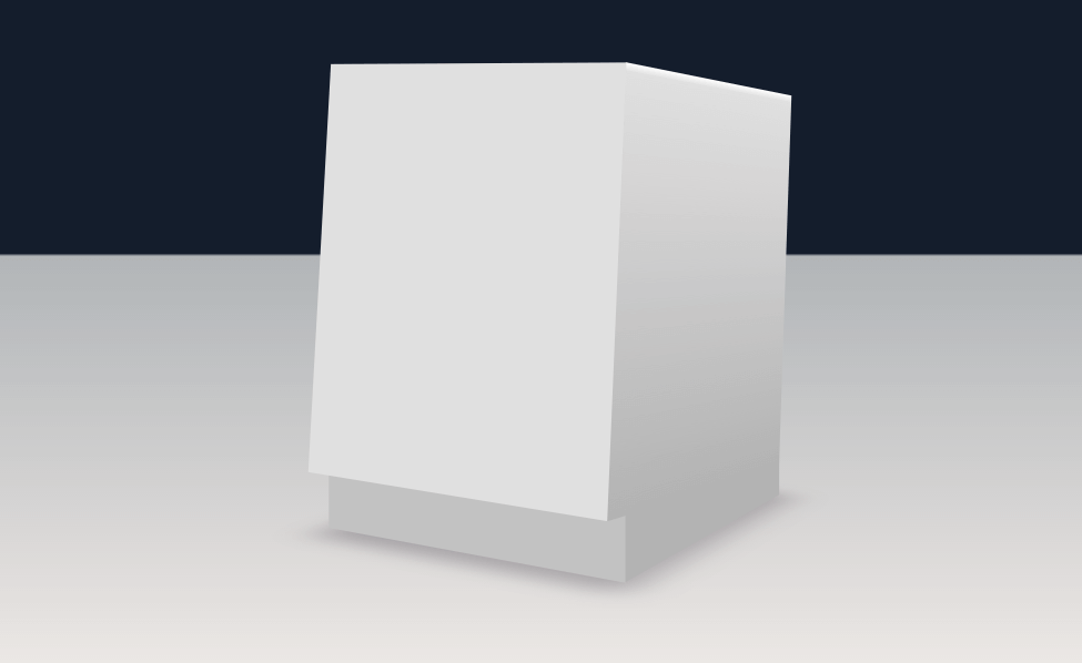
Each of the boxes are transformed into place using the CSS transform property, and CSS gradients are used to add depth to the scene.
The CSS looks like this:
.front {
  height: 11.5em;
  width: 9.6em;
  background: #e0e0e0;
  transform: rotateX(5deg) translateZ(5.43em);
}
.back {
  height: 11.5em;
  width: 9.6em;
  background: linear-gradient(top, #f2f2f2, #e6e6e6 0.25em, #c2c2c2);
  transform: rotateX(5deg) translateZ(-5.45em) rotateY(180deg);
}
.top {
  height: 10.95em;
  width: 9.6em;
  background-color: #ebf0dc;
  background: linear-gradient(left, #fafafa, #d9d9d9 0.25em, #d9d9d9 9.35em, #fafafa);
  transform: rotateX(5deg) rotateX(90deg) translateZ(5.45em);
}
.left {
  height: 11.5em;
  width: 10.9em;
  background: linear-gradient(top, #ffffff, #e0e0e0 0.25em, #b3b3b3);
  transform: rotateX(5deg) rotateY(-90deg) translateZ(5.45em);
}
.right {
  height: 11.5em;
  width: 10.9em;
  background: linear-gradient(top, #ffffff, #e0e0e0 0.25em, #b3b3b3);
  transform: rotateX(5deg) rotateY(90deg) translateZ(4.14em);
}
.base-front {
  height: 2.1em;
  width: 9.6em;
  background: #c2c2c2;
  transform: translateY(10.7em) translateZ(5em);
}
.base-back {
  height: 2.1em;
  width: 9.6em;
  background: #b3b3b3;
  transform: translateY(10.7em) translateZ(-5em) rotateY(180deg);
}
.base-left {
  height: 2.1em;
  width: 10em;
  background: #b3b3b3;
  transform: translateY(10.7em) rotateY(-90deg) translateZ(4.99em);
}
.base-right {
  height: 2.1em;
  width: 10em;
  background: #b3b3b3;
  transform: translateY(10.7em) rotateY(90deg) translateZ(4.58em);
}
.shadow {
  width: 10em;
  height: 11em;
  background: transparent;
  transform: rotateX(90deg) translateZ(-7.4em) translateX(20em);
  box-shadow: -20.2em 0 1.8em rgba(100, 90, 100, 0.4);
}
Each of the figures has been given a width and height, and a CSS background gradient or color. The figures are then each positioned using the transform property. For example, the left side is rotated 90 degrees before being translated (moved) back half the width of the computer.
The front figure is translated forwards, along the Z-axis, half the length of the computer and the back is rotated 180 degrees before being translated back.
For the pieces of the top box, each of the figures is rotated 5 degrees back around the X-axis. This means that the main body of the Macintosh Plus is tilted back.
Finally the shadow figure makes use of the CSS box-shadow property to create a shadow that makes it look like the box is sitting on a flat surface.
Bezels
A feature of this computer is the sloped edges around the front. These edges, which I'll refer to as bezels, help soften the hard corners of the box and make it look less boxy.
To achieve this I added some extra elements to the front figure, like so:
<figure class="front">
  <span class="bezel-top"></span>
  <span class="bezel-left"></span>
  <span class="bezel-right"></span>
  <span class="bezel-bottom"></span>
</figure>
The span elements within the front figure each represent one of these bezels. With some styles added, they will look like this:
This example can be found in the examples/04-Bezels folder.
The following CSS positions each, and makes use of a border-width trick to create sloped edges.
.front .bezel-top {
  border-top: 0.75em solid #f2f2f2;
  border-right: 0.5em solid transparent;
  border-left: 0.5em solid transparent;
  width: 8.6em;
}
.front .bezel-left {
  border-top: 0.5em solid #d9d9d9;
  border-right: 0.75em solid transparent;
  border-left: 0.75em solid transparent;
  width: 10em;
  transform: rotateZ(-90deg) translateX(-5.5em) translateY(-5.5em);
}
.front .bezel-right {
  border-top: 0.5em solid #d4d4d4;
  border-right: 0.75em solid transparent;
  border-left: 0.75em solid transparent;
  width: 10em;
  transform: rotateZ(90deg) translateX(5.5em) translateY(-3.62em);
}
.front .bezel-bottom {
  border-top: 0.75em solid #cccccc;
  border-right: 0.5em solid transparent;
  border-left: 0.5em solid transparent;
  width: 8.65em;
  transform: rotateZ(180deg) translateY(-10.76em);
}
Each bezel has 3 borders. For the top bezel, we set a colored border on the top. We then set two transparent borders on the left and right sides. In CSS, when a border meets a border of another color, the line where they meet is diagonal. This means that the transparent borders result in diagonal edges to the colored border.
This technique is applied to each of the bezels, creating the appearance of sloped edges on each.
The bezels also have a transform applied to rotate and position them at the side of the front figure.
More Details
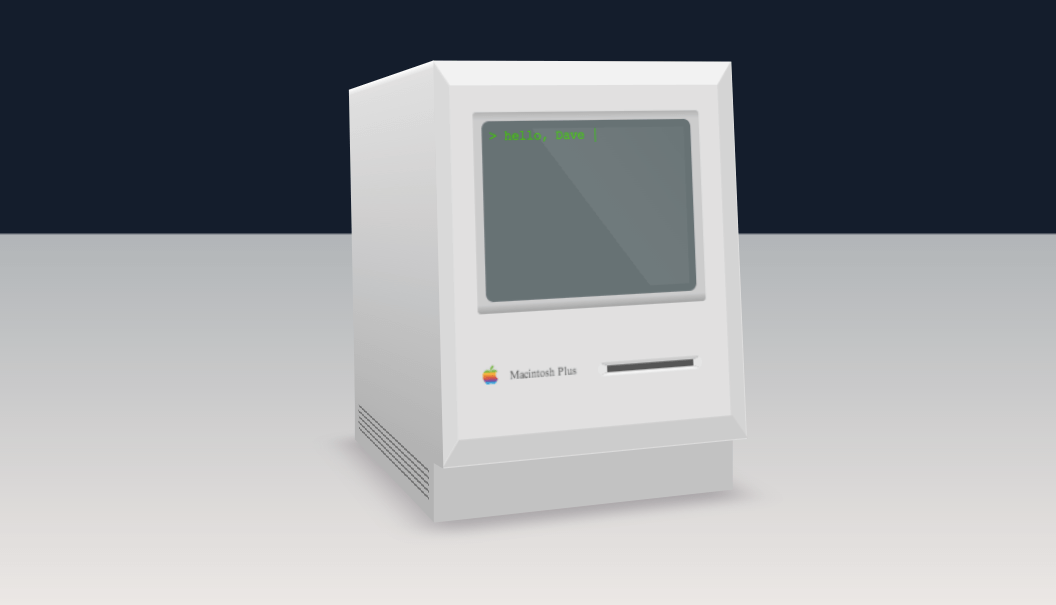
With the main boxes of the computer in place we can add the various details that make it look like a Macintosh Plus, such as the screen, icon and disk drive.
The front figure contains the following HTML:
<figure class="front">
  <span class="bezel-top"></span>
  <span class="bezel-left"></span>
  <span class="bezel-right"></span>
  <span class="bezel-bottom"></span>
  <figure class="screen-container">
    <span class="screen">
      <p>hello, Dave</p>
      <span class="sheen"></span>
    </span>
  </figure>
  <figure class="logo">
    <span class="image"></span>
    <span class="text">Macintosh Plus</span>
  </figure>
  <figure class="floppy"></figure>
</figure>
A working example can be found in the examples/05-Completed folder.
Screen
The screen is made up of several elements, including a container, the screen itself and a "sheen" layer on top.
The CSS for this makes use of CSS gradients to make it look inset into the front of the computer and the sheen span uses an almost-transparent gradient to give the screen some shininess.
Logo
The logo is made up of two parts, an image and some text. The image span contains a background image of the old colorful Apple logo, and the text is positioned next to it. The CSS for these can be found in the source files.
To create the right look, an embedded font is added. This uses the CSS font-face property. There are many ways to do this, but perhaps the easiest is to use a service such as Font Squirrel's @font-face generator to create the following CSS:
@font-face {
  font-family: "apple_garamondregular";
  src: url("../fonts/apple_garamond-webfont.eot");
  src: url("../fonts/apple_garamond-webfont.eot?#iefix") format("embedded-opentype"), url("../fonts/apple_garamond-webfont.woff") format("woff"), url("../fonts/apple_garamond-webfont.ttf") format("truetype"), url("../fonts/apple_garamond-webfont.svg#apple_garamondregular") format("svg");
  font-weight: normal;
  font-style: normal;
}
Font Squirrel helps by generating the various files (eot, woff, etc) that can then be placed in the project and called in within the CSS as shown.
The result is a font that closely matches the original.
Floppy drive
The floppy drive is a single element, and uses CSS borders to make it look like it's set into the front. The CSS that creates the effect looks like this:
.floppy {
  height: 0.2em;
  width: 2.8em;
  transform: translate3d(4.8em, 8.9em, 0);
  background: #555555;
  border-top: 0.1em solid #cccccc;
  border-right: 0.3em solid #e6e6e6;
  border-bottom: 0.1em solid #f2f2f2;
  border-left: 0.3em solid #e6e6e6;
  border-radius: 0.25em;
}
The floppy drive has a solid grey background color, and four borders. The top border is the darkest, with the bottom border being brighter to make it seem lit from above. Finally, a border-radius rounds the corners.
Putting the pieces together
Each of the pieces, when put together, look like this:
Adding animation
While what we have looks pretty good, we can properly show off the fact that it's a 3D object by making it move. To do this we'll make use of CSS keyframe animation.
In CSS, there are two types of animation. Transitions, in which elements on the page animate from one style or position to another, and keyframes, which represent a more complex series of animated steps.
A series of keyframes can be described as a series of percentages, with CSS describing each step. It could look something like this:
@keyframes back-and-forth {
  0% {
    transform: rotateY(40deg);
  }
  40%, 50% {
    transform: rotateY(-40deg);
  }
  90%, 100% {
    transform: rotateY(40deg);
  }
}
In this example the animation is called back-and-forth, and is made up of 3 steps. It begins rotated to an angle of 40 degrees. Then by the 40% mark, is rotated to minus 40 degrees. It stays at this rotation until 50%, then at 90% has returned to the original position.
The browser automatically fills in the gaps by animating the properties. In this case it will animate the angle of rotation.
Applying animation
To apply this animation we can use the CSS animation tag.
The animation tag looks like this:
animation: back-and-forth 14s ease-in-out infinite;
A few things are combined into one line here. It references the animation by name ("back-and-forth"), sets a duration of 14 seconds, and tells the animation to repeat indefinitely. The ease-in-out value refers to easing, which tells the browser to have the animation start and end gradually.
Applying this animation to the "positioning" div results in something like this:
What we learned
In creating and animating a 3D object in CSS, we covered quite a few techniques. We set the perspective and perspective-origin. We then made use of transforms to rotate, move and position elements, added gradients to give a more realistic 3D effect, and used some CSS border tricks to create bevels and depth. Finally we made use of keyframes and CSS animation to give the scene life.
Browser compatibility
Not all browsers can yet handle CSS transforms. Internet Explorer will struggle, but there is hope that support will be arriving in IE 11. All recent versions of Chrome, Safari and Firefox will do ok.
Modernizr provides a set of JavaScript tools to detect browser capabilities and can be used to show alternate content in cases where the browser cannot support a certain CSS property. In the example code, you'll find I've made use of Modernizr to detect the presence of 3D transforms. In cases where they don't exist, an image is shown instead.
Going forward
While the example might not seem like something you'd use in the average web site, the techniques can be applies to all sorts of scenarios.
For example, CSS transforms can be used to add depth to page transitions, image carousels, logos and buttons, to name a few. CSS animations can be used to add more interesting movement and finesse to your transitions, and CSS gradients can add depth to pages without a need to use images.

Make sure to follow on Twitter for all the latest updates!