Portal CSS
July 8, 2015
You don't need JavaScript to create impressive 3D projects in the web browser. In this post I will show how to create and animate a Portal-inspired scene using only CSS.
See the online Portal CSS demo, and download the source on Github.
Portal Orientation Video No. 1
As an example to show the various stages of creating, styling and then animating a 3D scene, this post will aim to recreate a scene from the Portal Training Video. In particular, the stylised, cartoony look of the first part of the video in which a silhouetted character jumps through a portal and emerges from the other side. This is the original video:
This video blew my mind when it was first released. Portal (which was developed from Narbacular Drop) introduced a fun twist on the 3D platform genre.
The isometric, cartoony graphics in the introduction video are very different from the game yet manage to capture some of it's style. In this post I will see if this cartoony style can be reproduced using nothing but HTML and CSS.
In particular, this is the scene that will be created:
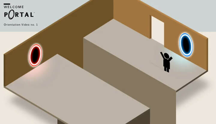
A quick note on prefixes
I've removed the prefixed versions of rules in the following CSS. I would recommend either using something like prefix free or SASS to manage these for you. Otherwise, be aware that most browser prefixes will need to applied. Full versions of the CSS and SASS can be found on Github along with the HTML.
There's science to be done
The following project has been developed and tested primarily in Chrome. It uses CSS that won't work properly in Internet Explorer. It covers some interesting 3D CSS techniques that while they aren't yet mainstream, can prove useful in other front-end development.
Getting started
We need to set a scene in which we can build our 3D creation. To do this we'll need to use an HTML element and give it the needed properties that tell the browser to expect 3D content within it. Start with some HTML:
<article class="container">...</article>In this case the container is an article tag. In HTML5, article represents a standalone piece of content that could be reproduced elsewhere and still make sense.
The first property to apply is perspective. This property takes a value in pixels, and represents the depth of the 3D scene. A smaller value will produce a more dramatic effect, and it's usual to set it somewhere betweeh 800 and 1,200 pixels.
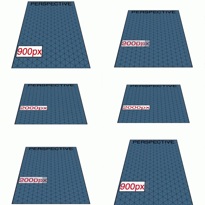
For this scene to feel like it's a large room, we will set the perspective value quite high at 2,600 pixels. Ignoring the various browser prefixes, we use the following:
article.container {
  perspective: 2600px;
}
Vanishing point
The container for the scene has a depth, so the next step is to determine the viewing angle. By adjusting the perspective-origin property, we can establish the scene's vanishing point, and determine whether we're looking down at the object or from the side.
.container {
  perspective-origin: 50% -1400px;
}
The perspective-origin property takes two values, a horizontal and a vertical offset. In this case we're setting it half-way across the scene, and 1,400 pixels up. This will result in our point of view being above the object, looking down.
To determine these values, I adjusted the value in the Chrome web inspector panel and judged it by eye. When setting up your scene, your value might be higher or lower than this. It will depend on the effect you want to convey. Also keep in mind that this value can be animated, creating some interesting perspective-change effects.
No vectors, Victor
The objects we position in HTML are normal HTML elements. They have a width, height, and are rectangular. This means that as you build a 3D object, you place each rectangle in place. This differs from some other methods that involve describing points and lines to create shapes. It also means that there aren't as many primatives, such as circles or cubes, to draw upon.
The HTML elements are placed within the 3D scene using the transform property.
Transforming
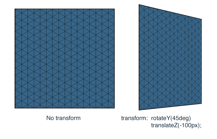
The transform property consists of a series of adjustments to the HTML element. These adjustments can take the form of translate to move the element, rotate to adjust it's angle, skew and even scale. Each of these can be stacked to create more complex transforms, for example:
.example {
  transform: rotateY(45deg) translateZ(-100px);
}
This rule will rotate an element 45 degrees around the Y axis, then move it back 100 pixels on the Z axis. The effect would look like this:
Transform origin property
When rotating elements around the place, it's worth keeping in mind that the transforms have an origin that can be set. The transform origin is a point referred to by specifying the X, Y and Z values. This is the default:
.default-origin {
  transform-origin: 50% 50% 0;
}
When building this example I kept the default but it's worth knowing that it's there.
Let's build
With the scene set, we can start putting together our 3D masterpiece. When beginning to build 3D objects with HTML and CSS, it's worth taking a moment to understand how this approach differs from other 3D software.
<section class="stage">
  <div class="shadow"></div>
  <div class="back-left"></div>
  <div class="back-right"></div>
  <div class="platform-left"><span></span></div>
  <div class="platform-right"><span></span></div>
  <div class="pit-left"></div>
  <div class="pit-right"></div>
  <div class="pit-back"></div>
</section>
The above includes a stage section, which we will be using to contain all the elements. A set of divs within the stage section form the main parts of the structure. They take the form of back pieces, platforms, the sides of the pit, and a shadow to place underneath them.
When I started building this scene, I tried to place the walls directly onto the stage, rotating it and adjusting its position. However since the scene is being viewed from an isometric angle, an easier approach is to place the parts of the scene and then rotate the entire scene 45 degrees at once.
With that in mind, the HTML elements are transformed into place according to the following sketch:
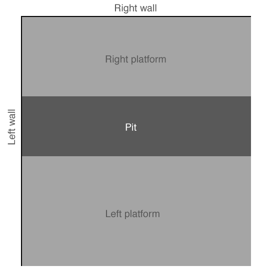
As the sketch shows, the back-left piece is aligned to the left, but the back-right piece is right in front of the viewer. To adjust for this, we'll rotate the entire stage 45 degrees later.
Before applying transforms however, we need to give the divs some shared properties:
.stage div {
  position: absolute;
  transform-style: preserve-3d;
}
Each div will be positioned absolutely, and the transform-style property to instruct the browser that 3D transforms are to be applied in relation to the perspective we set earlier.
With this done we can start positioning divs:
.stage .back-left {
  background-color: #6b522b;
  border-left: 6px solid #574625;
  border-top: 6px solid #8a683d;
  height: 120px;
  transform: rotateY(90deg) translateX(-256px);
  width: 500px;
}
The above rules describe a width of 500 pixels, which is the side length of our 3D scene, a height of 120 pixels and a light brown background colour. The div is then rotated 90 degrees and pushed back along the X axis. The div has a 6 pixel border applied to create the illusion of depth.
A similar transform is applied to the back-right div:
.stage .back-right {
  background-color: #9c7442;
  border-right: 6px solid #78552c;
  border-top: 6px solid #b5854a;
  height: 120px;
  transform: translateX(253px) translateZ(3px);
  width: 446px;
}
This div is a little smaller, as it looks like the room in the original Portal video is not quite square.
Next, add in some platforms and the sides of the pit:
.stage .platform-left {
  background-color: #bcb3a8;
  border-bottom: 6px solid #857964;
  height: 220px;
  transform: rotateX(90deg) translateY(396px) translateX(253px) translateZ(-13px);
  width: 446px;
}
.stage .platform-right {
  background-color: #bcb3a8;
  border-bottom: 6px solid #847660;
  border-right: 6px solid #554c3d;
  height: 164px;
  transform: rotateX(90deg) translateY(88px) translateX(253px) translateZ(-41px);
  width: 446px;
}
.stage .pit-left {
  background-color: #4d4233;
  height: 800px;
  transform: translate3D(254px, 125px, 285px);
  width: 447px;
}
.stage .pit-right {
  background-color: #847660;
  height: 800px;
  top: -1400px;
  transform: translate3D(254px, 125px, 173px);
  width: 451px;
}
.stage .pit-back {
  background-color: #6b522b;
  height: 220px;
  transform: rotateY(90deg) translate3D(-200px, 87px, 168px);
  width: 170px;
}
The end result of all this should be a scene that looks like this:
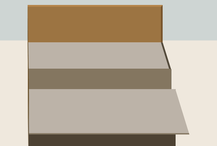
It doesn't look right yet. We need to rotate the entire scene to see it properly. Add a transform to the scene section:
.stage {
  margin: 0 auto;
  transform-style: preserve-3d;
  transform: rotateY(-45deg);
  width: 460px;
}
The result should look more like this:
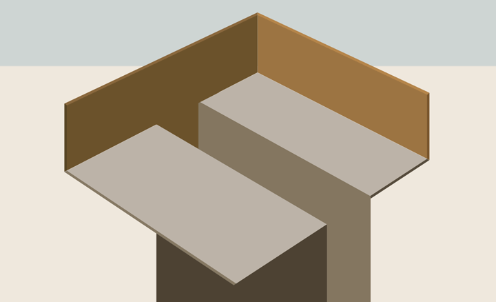
You may notice that the borders create a nice depth effect, particularly at the corners, where the different coloured borders meet with a 45 degree angle. Since the scene we're building is to be viewed at 45 degrees, this effect works to our advantage in most cases. A few of the corners don't quite look right, but considering how straightforward the borders are to apply, and the lack of images, I feel this is a reasonable compromise.
In the shade
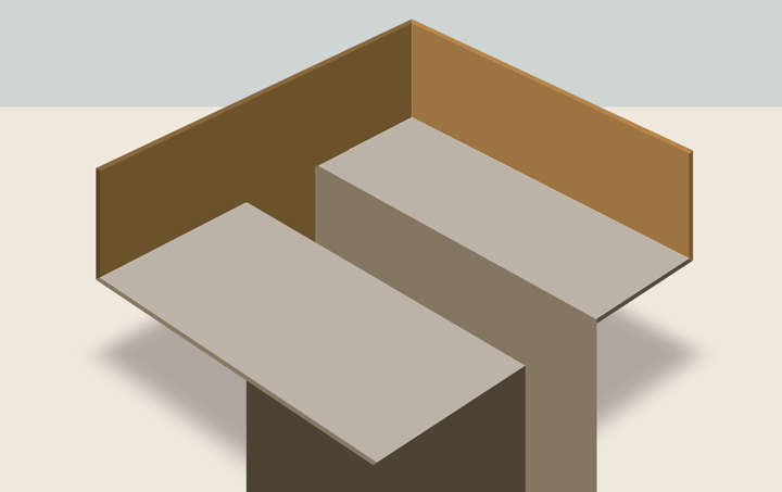
The video features a nice shadow beneath the platforms. We can reproduce this using the CSS box-shadow property.
.stage .shadow {
  background-color: transparent;
  box-shadow: -600px 0 50px #afa79f;
  height: 550px;
  transform: rotateX(90deg) translateZ(-166px) translateX(550px);
  width: 550px;
}
The rules above add a box shadow to the shadow div, which is itself transparent. The box shadow is offset by 600 pixels so that the actual shadow div doesn't get in the way of the shadow. The whole lot is rotated and positioned off-stage, so that only the shadow part is visible on the stage. The result should be something like this:
Red VS Blue
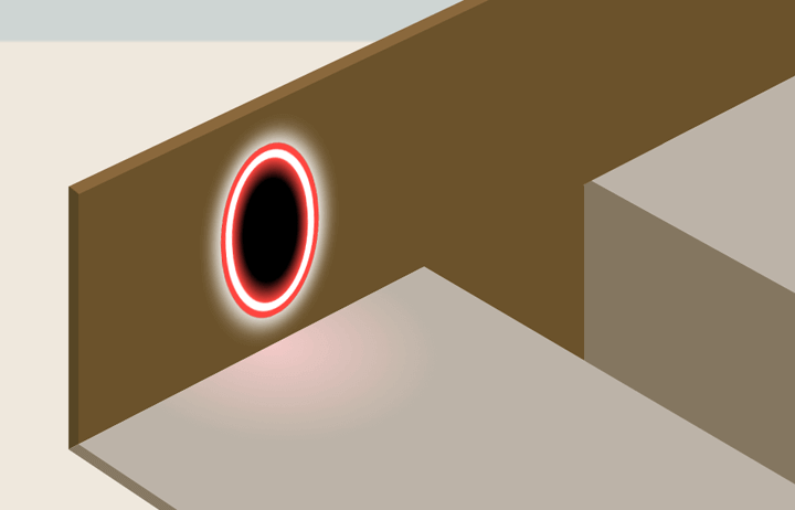
Next up we need to add some decoration and the glowing portals.
The HTML needed for the two portals is simple enough:
<div class="portal red"></div>
<div class="portal blue"></div>
There is a div for each of the two portals, one red and the other blue. They both have a similar style, with gradients used to create glowing effect. Since they are only one HTML element, the CSS includes a pseudo-element we can style to achieve the full effect.
The first step is to establish the general portal shape:
.stage .portal {
  background-color: black;
  border-radius: 44px/62px;
  box-shadow: 0 0 15px 4px white;
  height: 72px;
  width: 48px;
}
This sets up the portal and uses the border-radius property to create an oval shape, and a white box shadow creates a glow. A pseudo-element is then added that has similar dimensions, and the white border:
.stage .portal:before {
  border-radius: 44px/62px;
  border: 4px solid white;
  content: "";
  display: block;
  height: 72px;
  margin-left: -4px
  margin-top: -4px;
  width: 48px;
}
So far these styles have both applied to portals in general. Since one is red and the other blue, we'll use separate sets of CSS rules to describe the characteristics specific to each. Firstly, the red portal:
.stage .portal.red {
  background: radial-gradient(#000000, #000000 50%, #ff4640 70%);
  border: 7px solid #ff4640;
  transform: translate3D(223px, 25px, 385px) rotateY(90deg) skewX(5deg);
}
.stage .portal.blue {
  background: radial-gradient(#000000, #000000 50%, #258aff 70%);
  border: 7px solid #258aff;
  transform: translate3D(586px, 25px, 4px) skewX(-5deg);
}
The red portal is given a background radial gradient and a red border. The transform in this case rotates it and places it on the left wall. The blue portal is similar but has a blue gradient applied and is positioned on the right wall. Both looked a little off in testing, so I added a 5 degree skew effect that seemed to make them look a little better.
Portal glow
The HTML we added earlier included a span tag within each of the two platforms. These spans were added so that they could be styled with a radial gradient to provide a glowing effect beneath each portal.
.stage .platform-left span {
  background: radial-gradient(left, #f3cac8, #c8b8ad 70px, #bcb3a8 90px);
  display: block;
  height: 200px;
  left: 0;
  position: absolute;
  width: 120px;
}
.stage .platform-right span {
  background: radial-gradient(top, #cdebe8, #c2cbc1 40px, #bcb3a8 60px);
  display: block;
  height: 60px;
  left: 280px;
  position: absolute;
  width: 150px;
}
The two spans are positioned absolutely and given a red and blue gradient, positioned beneath each of the portals. A pseudo-element could have been used to achieve this effect, but since animating pseudo-elements is not well supported (even within versions of Webkit), a separate span is used in this case.
The Door
One of the unexpected successes was the use of borders to create what looks like an opening in the right wall, representing the exit. To create this door I use a single div and some coloured borders that make it look like it's inset.
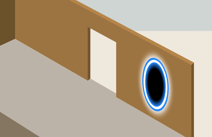
The door HTML is straightforward. Add the following within the stage section.
<div class="door"></div>Styling the door involves a few borders and then a transform that positions it in front of the right wall:
.stage .door {
  background: #efe8dd;
  border-bottom: 6px solid #bcb3a8;
  border-left: 7px solid #78552e;
  height: 85px;
  transform: translate3D(450px, 34px, 4px);
  width: 65px;
}
Two borders are used to create the effect. The bottom and left borders match the platform and the side of the right wall, giving the impression of depth. Since there is no top border specified, the left border stops flush with the top of the div, which in this case works well.
Characters
With the portals and door in place, we need a person to jump through one and arrive on the other side. The first step is to create the person that jumps through the two portals.
In my initial testing, I tried using one character and having the animation stop at the first portal, and immediately continue from the other side. However when I animated the single character there was a flicker as it moved between portals. To avoid this, I instead used two characters and animated them separately.
Building the character
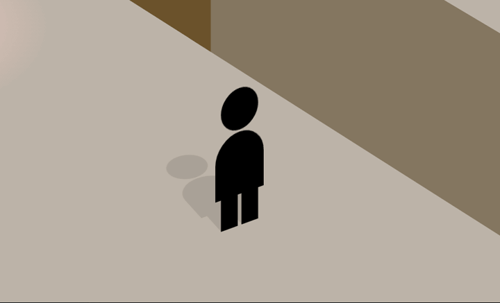
The beginning character shape is made up of 2 main parts, a head and body. Legs are added using pseudo-elements on the body. A similar structure is also included to be used as a shadow:
<div class="dude one">
  <figure class="head"></figure>
  <figure class="body"></figure>
  <div class="dude-shadow one">
    <figure class="head"></figure>
    <figure class="body"></figure>
  </div>
</div>
Since the shadow is contained within the character's containing div, it can be animated at the same time. The CSS is as follows:
.dude, .dude-shadow {
  height: 100px;
  width: 30px;
}
.dude figure, .dude-shadow figure {
  background-color: black;
  display: block;
  position: absolute;
}
.dude figure.head, .dude-shadow figure.head {
  border-radius: 22px;
  height: 20px;
  left: 3px;
  top: 0;
  width: 20px;
}
.dude figure.body, .dude-shadow figure.body {
  border-radius: 30px 30px 0 0;
  height: 30px;
  top: 21px;
  width: 26px;
}
.dude figure.body:before, .dude figure.body:after, .dude-shadow figure.body:before, .dude-shadow figure.body:after {
  background-color: black;
  content: "";
  height: 15px;
  position: absolute;
  top: 30px;
  width: 9px;
}
.dude figure.body:before, .dude-shadow figure.body:before {
  left: 3px;
}
.dude figure.body:after, .dude-shadow figure.body:after {
  left: 14px;
}
These rules double up in each case, describing both the character and their shadow. Each of the parts is absolutely positioned and border-radius is used to create the round shapes. The leg pseudo-elements are described at once then each positioned in separate rules.
Character 1
With the character shape specified, position the character at the starting position:
.stage .dude.one {
  transform: translate3D(514px, 50px, 375px) rotateY(78deg);
}
.stage .dude-shadow.one {
  opacity: 0.1;
  transform: translateX(-12px) rotateX(90deg) translateY(8px);
}
The CSS transforms position both the character itself but also the shadow. The opacity of the shadow is set to 0.1 rather than set it a grey colour. This allows background details to be seen behind the shadow.
The first character is now at the starting position, and rotated to a similar angle to that in the video. We will add animation later to have them jump through the portals.
Armed
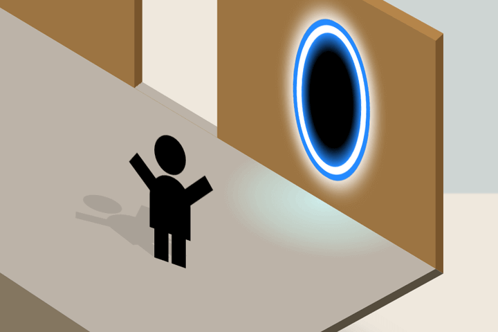
The second character has some more detail, arms. The idea being when the character jumps through the portal, they'll celebeate by raising their arms. Here's the HTML:
<div class="dude two">
    <figure class="head"></figure>
    <figure class="body"></figure>
    <figure class="arm left"></figure>
    <figure class="arm right"></figure>
    <div class="dude-shadow two">
        <figure class="head"></figure>
        <figure class="body"></figure>
        <figure class="arm left"></figure>
        <figure class="arm right"></figure>
    </div>
</div>
The second character will begin the animation invisible, and then jump through the portal about halfway through the animation (after the first character reaches their portal). To set this up, this second character is positioned at the portal.
.stage .dude.two {
  transform: translate3D(610px, 40px, 10px) rotateY(15deg);
}
.stage .dude.two figure.arm {
  background: black;
  height: 8px;
  position: absolute;
  top: 20px;
  width: 20px;
}
.stage .dude.two figure.arm.left {
  left: -13px;
  transform: rotateZ(40deg);
}
.stage .dude.two figure.arm.right {
  right: -10px;
  transform: rotateZ(-40deg);
}
.stage .dude-shadow.two {
  opacity: 0.1;
  transform: translateY(12px) translateX(-16px) translateZ(-6px) rotateZ(-90deg) rotateY(90deg) rotateZ(50deg) skewX(30deg) scaleX(0.8);
}
A second animation will be applied to the arms, in which they will also be invisible to begin with but then appear later.
The stage is set
With the characters and the backdrop in place, the scene is ready for some animation.
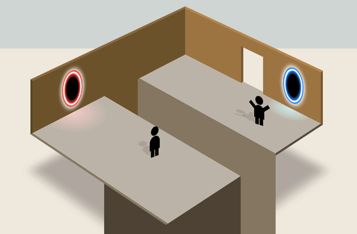
Let's look at how to make it look like the little person jumps through the first portal and arrives at the other.
Animation
If you view the demo you'll see a few animations taking place. Rather than go through all the animations that set up the scene, I'll focus on the animation of the character jumping through the portals.
Keyframe animation
Timing and animating the HTML elements is achieved by using keyframes, and then attaching the set of keyframes to an element using the animation property.
The first thing is to animate the first character, to have them approach and then jump into the left portal. Here's a set of keyframes that achieves this:
@keyframes move-dude-one {
  /* Character flies into scene */
  0% {
    transform: translate3D(514px, -10px, 375px) rotateY(78deg) scaleY(2);
  }
  /* Waits a moment */
  1%, 18% {
    opacity: 1;
    transform: translate3D(514px, 50px, 375px) rotateY(78deg) scaleY(1);
  }
  /* Moves toward the portal */
  34%, 39% {
    opacity: 1;
    transform: translate3D(284px, 40px, 375px) rotateY(78deg);
  }
  /* Pauses, them jumps in */
  41%, 42% {
    opacity: 1;
    transform: translate3D(234px, 40px, 375px) rotateY(78deg);
  }
  /* Vanishes */
  43%, 100% {
    opacity: 0;
    transform: translate3D(234px, 40px, 375px) rotateY(78deg);
  }
}
/* Note: Use prefixes, such as @-webkit-keyframes, @-moz-keyframes, etc! */
Keyframes are a series of steps, described using percentages. The percentage relates to the animation time, so that if an animation was to last 10 seconds, 10% would be the 1 second mark. 90% would be the 9 second mark.
To have the characters jumping through the portals in a nice loop, we'll set two animations that are each 10 seconds long so that they match. I have put some inline comments that describe each stage of the animation. The transform property is used at each stage to set the characters position and angle.
At 43% through the animation, the character's opacity is set to 0. This is when the first character vanishes into the portal. The second character should therefore appear at 43% through it's animation.
Before we do that, let's apply this first animation to the first character:
.dude.one {
  animation: move-dude-one 10s linear infinite;
  opacity: 0;
}
The animation property above applies the animation to the dude one element. It attaches it with the animation name, sets it to last for 10 seconds, and suggests that it loop infinitely.
An opacity of 0 is set to ensure the character is invisible before the animation starts.
Having done that let's set up the corresponding animation keyframes for the second character:
@keyframes move-dude-two {
  /* Dude be invisible */
  0%, 42% {
    opacity: 0;
    transform: translate3D(610px, 40px, 10px) rotateY(15deg);
  }
  /* Apparato! */
  42.5% {
    display: block;
    opacity: 1;
    transform: translate3D(610px, 40px, 10px) rotateY(15deg);
  }
  /* Move onto the platform */
  46%, 75% {
    opacity: 1;
    transform: translate3D(610px, 40px, 120px) rotateY(15deg);
  }
  /* Stand there for a bit */
  76%, 97% {
    opacity: 0;
    transform: translate3D(610px, -10px, 120px) rotateY(15deg) scaleY(2);
  }
  /* Fly up into the sky! */
  98%, 100% {
    opacity: 0;
    transform: translate3D(610px, -10px, 120px) rotateY(15deg) scaleY(2);
  }
}
@keyframes arms {
/* No arms */
0%, 53% {
opacity: 0;
}
/* Yes arms! */
54%, 100% {
opacity: 1;
}
}As planned, this animation begins around the 42% mark. The character leaps out of the portal, stands around for a bit, then is whisked away into the sky. A second set of keyframes describe the arms animation. These start off invisible and then show around halfway through the animation.
We can apply these keyframes to the second dude's element as follows:
.dude.two {
  animation: move-dude-two 10s linear infinite;
  opacity: 0;
}
.dude.two figure.arm {
animation: arms 10s linear infinite;
opacity: 0;
}In this way the two animations are being applied. Since both are set to last 10 seconds, and loop infinitely, they should match up nicely with the timing of the first animation.
If you haven't already, check out the finished result in a modern browser, though preferably not Internet Explorer.
Caveats & browser quirks
While we're on the subject of browsers, I should note that this is not going to work currently in Internet Explorer. Firefox is a bit meh but not bad, Safari's almost there (waiting for Apple to patch webkit at long last), and Chrome is 100%. Hey, browsers gonna browse.
Performance is pretty good across various devices (browser issues aside). Testing on an iPhone with Safari and it performs better than Chrome on a laptop. This is because the CSS rules used (3D transforms) make use of the graphic hardware.
Demo and contact info
Check out the online Portal CSS demo or download the source from Github.
