
Transitions in space
April 21, 2017
A few simple transitions can make a huge difference. In this article we'll learn how we can use transitions to bring our content to life, as well as plan and build our hover effects to perform smoothly and look great.
Transitions vs animations
Transitions are a great way to smooth the changes from one state to another (and back again) in the browser. They seem like a simpler alternative to the keyframes and animation approach, but they are useful in very different ways.
For example, a transition isn't much use if you want an animation to play on load, or if you want it to loop infinitely. But if you have two states and you want to be able to easily animate back and forth between the two, a transition's the best choice.
I've written more about the differences between transitions vs animations.
In this example we're going to build up a space scene and introduce a hover effect to reveal some more information about the planet. We'll see how to think about setting the default and hover states, and what sorts of properties are best used to ensure smooth, jank-free animation.
You can find the full demo here.
Setting the states
When creating transitions most of the time and effort needs to go into the before and after states. We need to think about how it's going to look before the transition and then how it needs to look once the transition has finished.
When I'm building more complex transitions I tend to not worry too much about the movement between these states until I'm happy that both states look right. Having said that it's important to think about the properties we use to create the hover state, as these properties are going to be animated.
Before we get into that though let's set up the starting and hover states.
Starting state
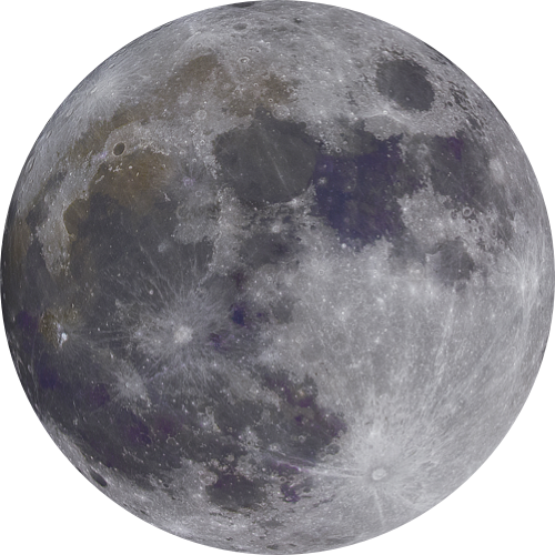
We begin with out planets places in the middle of the screen. The moon happily rotates around the earth.
The HTML contains an article within which we have our earth and moon elements. I've also wrapped the moon in a moon-container div as this will help when repositioning it later for the hover effect.
<article class="earth-demo">
  <div class="earth">
    <img src="https://cssanimation.rocks/images/random/earth.png">
  </div>
  <div class="moon-container">
    <div class="moon">
      <img src="https://cssanimation.rocks/images/random/moon.png">
    </div>
  </div>
</article>
Here's the CSS we use. For the earth element we position it absolutely, and use a calc trick to position it in the middle both horizontally and vertically.
.earth {
  position: absolute;
    top: calc(50% - 100px);
    left: calc(50% - 100px);
}
The image is also positioned and given a height and width.
.earth img {
  height: 200px;
  position: absolute;
    top: 0;
    left: 0;
  width: 200px;
}
For the moon we do something similar. Beginning by placing the container in the middle of the screen.
.moon-container {
  position: absolute;
    top: calc(50% - 25px);
    left: calc(50% - 25px);
}
We set up the dimensions for the moon and give it an animation using the spin keyframes. This will set it spinning around the Earth.
.moon {
  animation: spin 20s linear infinite;
  background: none;
  height: 50px;
  pointer-events: none;
  transform-origin: 25px;
  width: 50px;
}
At this point through, the moon is actually positioned in the middle of the screen, right on top of the earth. Let's use a transform to push the moon outside it's container and outside the planet.
.moon img {
  height: 50px;
  transform: translateX(-160px) translateY(-160px);
  width: 50px;
}
This means that when the moon div rotates on top of the planet Earth, the actual image will be rotating further out. Next we give the images a border radius to tidy up any antialiasing issues and a box-shadow to give them a blue glow.
.earth img, .moon img {
  border-radius: 50%;
  box-shadow: 0 0 12em 1em rgba(110, 140, 200, .6);
}
Lastly, we want the moon to spin, so we create some keyframes. This is a simple one, we just want the animation to rotate around the Z-axis by 360 degrees.
@keyframes spin {
  to {
    transform: rotateZ(360deg);
  }
}
Here's what we have so far.
See the Pen Planet hover effect part 1: initial stage by Donovan Hutchinson (@donovanh) on CodePen.
Showing more info
We'd like to show some useful information about the planet Earth on hover. Perhaps useful for alien visitors to get some insight into our home before they visit.
Before we set up the hover state we need to add this extra info.
We begin by expanding the HTML to add in a more-info block containing some text.
<article class="earth-demo">
  <div class="earth">
    <div class="more-info">
      <h1>Earth</h1>
      <ul>
        <li>Third planet from the Sun</li>
        <li>Atmosphere: 21% oxygen</li>
        <li>Liquid water on surface</li>
        <li>Only planet that has life (that we know of)</li>
      </ul>
    </div>
    <img src="https://cssanimation.rocks/images/random/earth.png">
  </div>
  <div class="moon-container">
    <div class="moon">
      <img src="https://cssanimation.rocks/images/random/moon.png">
    </div>
  </div>
</article>
This is added within the earth container as I'd like it to be part of the hover effect, so that when the cursor hovers the text it'll stay on the screen.
In our CSS we add some styles for this more-info block.
.earth .more-info {
  background-image: linear-gradient(to bottom, rgba(10,10,10,1), black);
  border-radius: 1em;
  color: #fff;
  opacity: 0;
  padding: 1em;
  transform-origin: 0 0;
  transform: scale(.8);
  width: 400px;
}
.earth .more-info h1 {
margin: 0 0 1em;
text-align: right;
}Here we're setting the background colour and border radius, text colour as well as padding and width. We're also scaling it a little using the scale transform and we set the transform-origin to the top-left corner so that it will scale from that direction.
The opacity for this more-info block is set to zero so that it's invisible. We could go further and add in visibility to make sure the content doesn't interfere with other content but for this demo it's fine.
Transitioning the right properties
When setting up the hover transition animation it's important to think about performance. Properties such as height, padding, font-size or background-position can all be animated but they don't tend to perform well. The reason being that they cause the browser to recalculate all sorts of other details in the layout when they change.
It's a good idea to stick to the opacity and transform properties when animating as these do tend to perform well and don't cause any "jankiness".
In this example we're using the transform and opacity properties. The more-info block is scaled down a little with a transform and has opacity of 0. In our hover state we can
How we make use of the transform and opacity properties specifically. Let's set up the hover state to set the more-info block to be visible, while getting the planet itself out of the way.
Hover effect
Let's start setting up each of the .earth:hover states. If you're using Sass you can write this a little more succinctly but for now I'm using vanilla CSS.
Firstly let's more the planet out of the way.
.earth:hover img {
transform: translateX(-75px) translateY(-75px) scale(.5);}
This transform pushes the planet up and left by 75 pixels while scaling it down to 50% in size. Powerful!
Next we do a similar thing to the moon.
.earth:hover ~ .moon-container {
transform: translateX(-75px) translateY(-75px) scale(.5);}
.earth:hover ~ .moon-container img {
transform: translateX(-140px) translateY(-140px);
}
There's a second tweak here to the moon's image. I'm adjusting its transform to bring it a little closer to the earth. Next we show the more-info block.
.earth:hover .more-info {
opacity: 1;
transform: none;
}
This sets the opacity to 1, making it visible and we set the transform to none so that the block scales up to the normal size.
Here's the result. Hover over the planet to see the content.
See the Pen Planet hover effect part 2: basic hover effect by Donovan Hutchinson (@donovanh) on CodePen.
Applying transitions
Now that the hard work is done, all we need to do now is tell the browser how to transform between these states. Thankfully there's not too much involved. Most of the transitions can be handled with one CSS rule.
.earth-demo * {
  transition: all 4s cubic-bezier(0,1.5,.3,1);
}
Let's break this down. Firstly this rule uses the asterisk "*" to make it apply to all elements within the earth-demo article.
It then applies a transition to all properties, lasting 4 seconds and using a cubic-bezier timing function. This function is a kind of exponential ease-out, meaning that it starts off very fast and slows down toward the end. It also overshoots a little and settles back.
Before we call it a day, let's just add a little nuance to the list of text. It would be nice to call attention to the list elements by having them animate into place one at a time. Thankfully we can do that with the transition-delay property.
Transition delays
We first want to set the opacity for these items to zero so that they are invisible before the transition starts.
.earth-demo h1, li {
  opacity: 0;
}
Then when the hover happens, we show them.
.earth-demo:hover h1, li {
  opacity: 0;
}
Next we want to delay each of the 4 list items. We can do that using the nth-child selector.
.earth-demo:hover li:nth-child(1) {
  transition-delay: 0s;
}
.earth-demo:hover li:nth-child(2) {
transition-delay: 0.2s;
}.earth-demo:hover li:nth-child(3) {
transition-delay: 0.4s;
}.earth-demo:hover li:nth-child(4) {
transition-delay: 0.6s;
}This will add a delay to each of the list items. Since we're using the "*" selector above, each of these list items has a transition and we only need to specify a delay.
Here's the finished result.
See the Pen Planet hover effect part 3: with transition by Donovan Hutchinson (@donovanh) on CodePen.
So there we have it! A seemingly complicated animation, I mean transition carried out with just one CSS rule.
In this article we've learned how to approach planning and building the states for an impressive transition, and made sure our animation is smooth and looks great.
Next steps
There's loads we can do to bring our websites to life using animation and this is just one small part. If you'd like to become an expert in applying movement to your UI and web projects, don't miss your chance to Level up your CSS animation skills today!

Make sure to follow on Twitter for all the latest updates!