WWDC 2015
April 30, 2015
Every year Apple runs a special event for their developers called WWDC. WWDC (Apple's Worldwide Developer Conference) is a chance for iOS and OSX designers and developers to learn all about what cool stuff Apple's up to and what to expect in the new versions of the mobile and desktop software.
With each year's event, they create a beautiful invitation. This year I was quite taken with the overlapping circles and shapes, and decided to have a go making it in HTML and CSS.
WWDC 15 invitation
Apple's icons often use overlapping colours and shapes, like a iOS 7 Photos icon. This year the invitation to WWDC included this image:
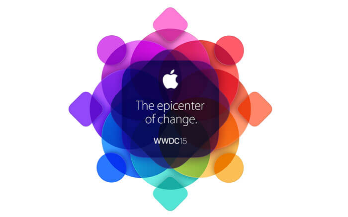
It's made up of a set of overlapping, semi-transparent shapes. Perfect to recreate with some HTML and CSS.
Planning: HTML
Taking on a complex piece like this involves a bit of planning. For this example, I broke the layout down into it's parts.
The logo is made up of 3 sets of shapes. The basis is made up of 8 large circles, so I began by listing them out:
<div class="large circle one"></div>
<div class="large circle two"></div>
<div class="large circle three"></div>
<div class="large circle four"></div>
<div class="large circle five"></div>
<div class="large circle six"></div>
<div class="large circle seven"></div>
<div class="large circle eight"></div>
I'm using multiple classes here so that I can write CSS that applies to all large elements, and CSS that applies for all circle elements, etc. The more we can reuse the CSS, the simpler it should be.
We now have eight smaller shapes that sit in front and sit out at the edge of the large circles. These shapes are made up of four circles and four "squircles", squares with a rounded edge. I'll add some HTML for them:
<div class="small circle one"></div>
<div class="small squircle two"></div>
<div class="small circle three"></div>
<div class="small squircle four"></div>
<div class="small circle five"></div>
<div class="small squircle six"></div>
<div class="small circle seven"></div>
<div class="small squircle eight"></div>
We have the eight smaller shapes listed here, with alternating circle and squircle classes. I've labelled each set with numbers one through eight. This will be useful when we position the shapes and give them colours.
Lastly we have two large squircles in the middle of the logo.
<div class="large squircle one"></div>
<div class="large squircle two"></div>
Again these are of the large size and the squircle shape.
Logo and content
Before moving on to style this HTML we'll add some content for the central squircle.
<div class="large squircle two">
  <div class="content">
    <svg viewBox="0 0 160 164" xmlns="http://www.w3.org/2000/svg">
   <g>
    <g id="svg_1">
     <path d="m127.805969,90.003128c0.224838,24.213104 21.241287,32.270615 21.474121,32.373459c-0.177704,0.56826 -3.358078,11.482742 -11.072464,22.756622c-6.668747,9.746841 -13.590027,19.457977 -24.493088,19.659103c-10.713348,0.197403 -14.158287,-6.353043 -26.406677,-6.353043c-12.24469,0 -16.072174,6.151901 -26.213551,6.550446c-10.52422,0.398254 -18.538303,-10.539917 -25.26247,-20.251053c-13.740021,-19.864456 -24.24024,-56.132286 -10.1411,-80.613663c7.004152,-12.157551 19.521101,-19.85622 33.10713,-20.053638c10.334515,-0.197132 20.089069,6.952717 26.406689,6.952717c6.313614,0 18.167473,-8.59832 30.628998,-7.335548c5.21682,0.217129 19.860519,2.1073 29.263641,15.871029c-0.75766,0.469692 -17.472931,10.200527 -17.291229,30.443592m-20.134499,-59.456692c5.587379,-6.7633 9.348007,-16.178439 8.322067,-25.546439c-8.053787,0.32369 -17.792625,5.36682 -23.569427,12.126399c-5.177124,5.985922 -9.711121,15.566772 -8.48777,24.749359c8.976891,0.69453 18.147476,-4.561718 23.73513,-11.329308"/>
    </g>
   </g>
  </svg>
  <h1>The epicenter of change.</h1>
  <p><strong>WWDC</strong>15</p>
</div>
Here we have an inline SVG image and the text from the invitation. The font used on the original image is "San Francisco". This font isn't standard yet on OSX so for now I'll replace it with Helvetica Neue Light.
Styling the circles and squircles
The first thing we want to set up is the circle and squircle elements.
.circle, .squircle {
  border-top: 0.1em solid rgba(255,255,255,0.4);
  height: 12.5em;
  position: absolute;
  width: 12.5em;
}
Most of the shapes are of the larger variety so I'll style them at the larger size by default. Each of the elements uses position absolute and has a light white border on top. This border might not match exactly with the invitation image but helps give the shapes a little sheen.
Next we'll set styles for the large circles. Using a border-radius of 50%, we can create the circle shape. We then position them using left and top values.
.circle {
  border-radius: 50%;
  box-shadow: 0 1em 2em rgba(0,0,0,0.5);
  left: calc(50% - 6.25em);
  top: calc(50% - 12.5em);
  transform-origin: 50% 12.5em;
}
At this point, all the circles are in the same place! But the trick here is in the transform-origin value. When you rotate an object in HTML using a transform, it rotates around a point called the transform-origin. This point is usually in the middle (50%, 50%) of the element.
In this case we've moved this point down to the bottom of the circles. When we rotate the circles, they'll fan out into the circular shape in the logo.
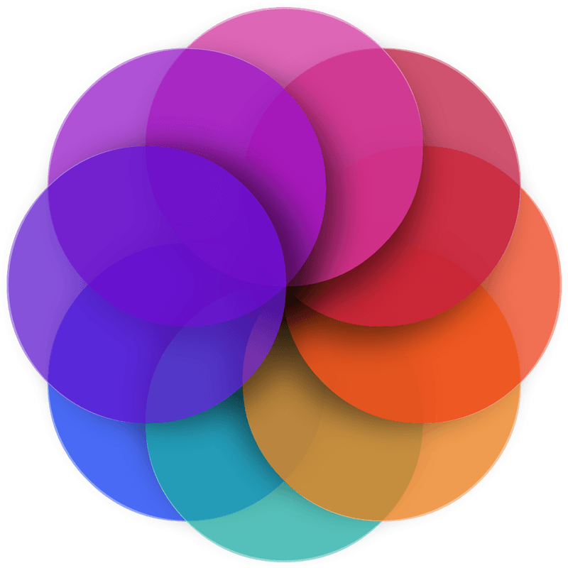
Let's add the CSS to position each of these circles. Looking carefully at the invitation image, we can see that the circle sitting behind all the rest is on the bottom-left. With this in mind we'll make sure the first circle in the HTML is rotated around to that position.
.one {
  background: rgba(16, 63, 236, 0.75);
  transform: rotateZ(225deg);
}
.two {
  background: rgba(37, 172, 162, 0.75);
  transform: rotateZ(180deg);
}
.three {
  background: rgba(233, 124, 32, 0.75);
  transform: rotateZ(135deg);
}
.four {
  background: rgba(235, 67, 35, 0.75);
  transform: rotateZ(90deg);
}
.five {
  background: rgba(190, 28, 65, 0.75);
  transform: rotateZ(45deg);
}
.six {
  background: rgba(208, 57, 159, 0.75);
  transform: rotateZ(0);
}
.seven {
  background: rgba(150, 32, 198, 0.75);
  transform: rotateZ(-45deg);
}
.eight {
  background: rgba(95, 33, 203, 0.75);
  transform: rotateZ(-90deg);
}
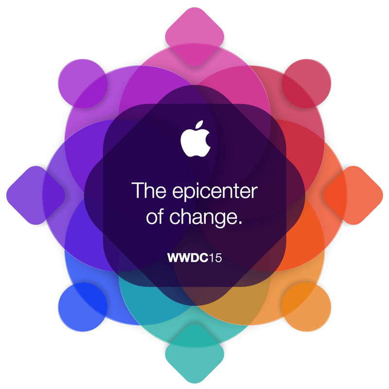
Each of these styles has a colour and a transform to rotate it into position. This animation shows how all the circles are placed at the top-middle of the screen, then rotated into place.
With the circles in place, we can style the other shapes. Firstly, a squircle is a circle but with a different border radius.
.squircle {
  border-radius: 25%;
}
When we positioned the circles, we specified a rotation and a colour. Happily enough, the smaller shapes can use this same CSS too. We'll first need to give these small shapes some styles of their own.
.small {
  width: 4em;
  height: 4em;
  left: calc(50% - 2em);
  top: calc(50% - 15em);
  transform-origin: 50% 15em;
  box-shadow: 0 0.25em 0.5em rgba(0,0,0,0.2);
}
We set up these shapes to be smaller and position them a greater distance up from the middle. By using the same transform-origin trick, the rotate transforms from earlier will put them into the correct position without need for any more CSS.
Small squircles
The small squircle shapes are the wrong angle. They need to be rotated a further 45 degrees.
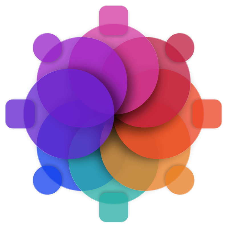
There are a couple of ways we could do this. We could add an extra element to each squircle and add a transform, or we could use a pseudo-element in the CSS. Either way is good but I thought it would be interesting to handle it in the CSS.
First we remove the background, border and box shadow from the small squircles.
.small.squircle {
  background: none;
  border: none;
  box-shadow: none;
}
We can now use the ::after pseudo-element to create a new squircle within each, and rotate them 45 degrees.
.small.squircle::after {
  background: red;
  border-radius: 25%;
  box-shadow: -0.25em 0.25em 0.5em rgba(0,0,0,0.2);
  content: "";
  height: 100%;
  position: absolute;
  transform: rotateZ(-45deg);
  width: 100%;
}
.small.squircle.two::after {
background: rgba(37, 172, 162, 0.75);
}
.small.squircle.four::after {
background: rgba(235, 67, 35, 0.75);
}
.small.squircle.six::after {
background: rgba(208, 57, 159, 0.75);
}
.small.squircle.eight::after {
background: rgba(95, 33, 203, 0.75);
}We should now have both the large circles and the smaller shapes in place.
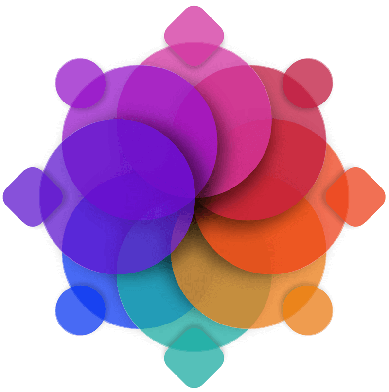
Content squircles
The last piece of the image is the two squircles that contain the content. Let's position them in the middle and give them a slightly transparent dark colour.
.large.squircle {
  background: rgba(30, 7, 66, 0.65);
  border: none;
  height: 15em;
  left: calc(50% - 7.5em);
  position: absolute;
  top: calc(50% - 7.5em);
  transform: none;
  width: 15em;
}
We can then rotate the first of these squircles (the one that sits behind the squircle containing the content).
.large.squircle.one {
  transform: rotateZ(45deg);
}
Adding animation
The original invitation image is not animated, but this site is called CSS Animation Rocks after all, so let's try some animation.
I'd like to make each of the sets of circles and squircles spin. To do this we can wrap each in a span and apply an animation to the span wrapper.
<span class="large-circles">
  <!-- Large Circles here ... -->
</span>
<span class="small-shapes">
  <!-- Small Shapes here... -->
</span>
  <!-- Squircles -->
<span class="content-squircle">
  <div class="large squircle one"></div>
</span>
First we position these span elements so that they don't break the layout.
span {
  display: block;
  height: 20em;
  left: calc(50% - 10em);
  position: absolute;
  top: calc(50% - 10em);
  width: 20em;
}
This places the span wrappers in the middle of the page.
Next we will apply animations to each of these three span elements.
.large-circles {
  animation: spin 10s linear infinite;
}
.small-shapes {
animation: spin 30s linear infinite;
}.content-squircle {
animation: spin 20s linear infinite;
}We're using the same set of keyframes each time, but changing the animation-duration of each. I've chosen 10 seconds, 20 seconds and 30 seconds so that they'll line up every minute.
With the animation property in place, let's put together the keyframes.
@keyframes spin {
  0% {
    transform: rotateZ(0);
  }
  100% {
    transform: rotateZ(360deg);
  }
}
This starts with zero rotation and finishes the animation having rotated around 360 degrees. See it in action in this demo.
Reusing CSS
This is a fun experiment in creating overlapping shapes using CSS but one thing that I found most helpful was the way the CSS was reused in some places. Rotating both the circles and the smaller shapes was handled by the same CSS, and the animations all used one set of keyframes. This can be a good way to keep your CSS files small and make sure they load quickly.
Prefixes
When creating this example, I used autoprefixer to avoid having to think about adding browser prefixes. Do keep this in mind if you're using transitions, animations or transforms in production.

