Build an awesome Hero Header
March 20, 2017
When people arrive on your homepage you have mere seconds to impress them, explain what you're about and convince them to stick around. This is an important moment yet most sites miss the opportunity to impress and connect with their visitors.
Let's make sure your hero header stands head and shoulders above the rest.
What to include in your Hero Header
There are all sorts of ways you can tackle your hero header. You might want it to take over the entire page, maybe it needs to showcase new products, or explain in one short sentence what your brand does. There are some ingredients most hero headers share. These might include:
- An eye catching headline
- A call to action
- Large striking background image or video
- An embedded explainer video or animation
- A carousel showcasing featured content
- Company branding - logo or slogan
- Branding and navigation
- Animation
Let's go through each of these and see how each can be built into our hero header section.
The headline
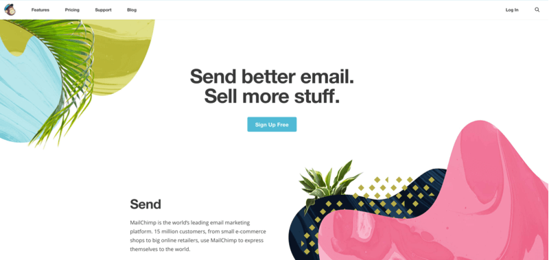
We start with the headline. This is likely the first thing your visitors will read. It needs to be easy to understand while also conveying the right message. In this example, Mailchimp uses the space to explain that their service helps you "Send better email" and "Sell more stuff". This is short and easy to read but also lets me know just what it is Mailchimp does.
Getting the style right
When making your text easy to understand, it also needs to be clear. Again in the previous example the dark text is set against a plain white background. There's no way to miss that headline! A large, bold font helps too. In this example from Tito we see the text set against a background image. The image is faded a little to let the text stand out better.

If you're using background images it's usually a good idea to go for large white text as it tends to be easier to read than dark text. Here are some handy tips on helping your text stand out on an image.
The call to action
Once you've established your initial message through the big, eye catching headline the next step is to guide your visitor into the action you want them to carry out. This might be clicking a "sign up" button, encouraging them to see your products or projects, or leave their email with you. This usually takes the form of a button or a form (with a button) and is called the "call to action".
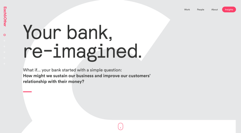
When designing your call to action you need to make sure it stands out visually. This could mean using a brand colour as the background, making it large or placing it in a prominent position on the screen. Front and center just under the headline is a popular choice, but it doesn't have to be. A good highlight colour can make a call to action stand out even when it's up in the top right corner, like on this example from Each&Other.
Once you have it in place, the next thing to consider is your choice of words. Think in terms of actions. What would you like your customer to do? Phrases such as "Get started", "Download now" or "Sign up" are all very action oriented and help your visitor understand what the button means. Try to avoid terms like "Submit" or "Go". A vague phrase here can slow people down, and what you really want is for your happy visitor to confidently press the button.
The background image
We have a strong message and an action. You might want to consider the wider page next. Many hero headers make use of large background images. These can really bring life to your design and help people connect with the message or feeling behind the design.
There are lots of great places to buy royalty-free images. A Google search will turn up loads. When I'm getting started on a design I'll often turn to Unsplash as they provide a load of great, free images that I can quickly try in designs and see what sort of images work best.
Dimensions and file size
When you've found your ideal image, you need to prepare it for your hero header. You want the image to be big enough to cover the screen, but not so massive it takes a long time to download. Photos tend to scale up on very large screens quite well so I would usually scale a photo down to about 1400 to 1600px wide. This should look good on most screens.
Photos should be saved as JPEG files and compressed. Depending on the type of photo you could expect the finished file size to be about 200 to 500KB. Larger sizes will become slow and noticeably delay your site's loading times. You really want your hero header to appear quickly, so making sure the images you use are compressed is important. I use Tinypng as a last step in compressing my images.
Don't worry about the name, it'll work on .jpg files too!
Filling the entire viewport
Screens can be all sorts of sizes. Often we want our hero header to fit itself to the screen but it's hard to know whether people will have a wide short browser window, or a narrow tall window. We can use two tricks to get our hero header to fill the available space. Setting the background size to cover and the height of the hero header to 100vh.
.hero-header-container {
background: url(/images/awesomephotodude.jpg) no-repeat center;
background-size: cover;
height: 100vh;
position: relative; /* Useful for any "absolute" positioned elements inside */
}
Setting the background image size to cover tells the browser to scale and crop the image in such a way that it fills the available space. Keep in mind this means it could crop the sides off on a tall screen, or lose the top and bottom on a wide screen. Experiment to see which works best for you. (Hint: using media queries to show different images at different widths and heights could be an idea here.)
The "vh" stands for "viewport height" and is a percentage. In this way 100vh means the entire viewport height.
Adding a gradient on top
We have our lovely background image but now we find it's hard to see our headline! This happens a lot. There are a couple of ways we can fix this. One way might be to blur or darken the original photo. Like in the Tito example above, applying a filter to tone the image back really helps the headline stand out.
Another approach might be to use the power of CSS. We can make use of CSS to apply a background gradient on top of our hero header's photo. One way to do this might be to use a pseudo-element:
.hero-header-container:before {
  background: linear-gradient(to bottom, rgba(0,0,0,.5), rgba(0,0,0,.8));
  content: "";
  position: absolute;
    top: 0;
    right: 0;
    bottom: 0;
    left: 0;
}
Here we add a before pseudo-element that sits behind our content but in front of the background image. In this case it's a gradient from grey to darker grey. You could substitute a solid colour or a different gradient, or even a background image. Alternately you could add a background colour or image to your heading.
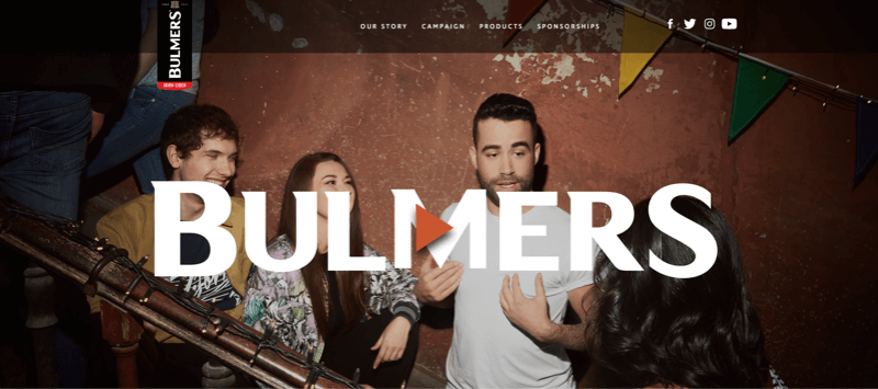
The main idea is to make sure your foreground text stands out against the photo, like in this example from Bulmers.ie.
Background video
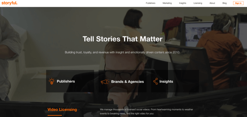
Sometimes having a big image isn't enough, and you need something more. A popular option is to embed a video in the background of the page and have it play automatically on load. In this example from Storyful we have a full-screen background image showing the way the company works.
Videos can look great but you need to make sure they're optimised for the web. This means keeping them short, usually 10 to 20 seconds at most. They should be scaled down to a relatively low resolution and compressed so that the file size is close to 10MB or so.
Videos can be hosted on your own server but it's usually better to use a service such as Embed.ly to take care of the hassle.
If you're looking for great free videos to get started, I've found Coverr a great starting point. It's like Unsplash but for video.
You can even mix in a bit of a background image with transparency to act as a mask in front of the video, as seen on this lovely site from Adapt.

Explainer video
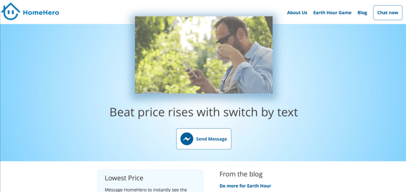
Setting the scene on your hero header with a background image or video might not be enough. We can still use video though, but put it front and center to tell the story of our brand. In this example from the (now dead, sadly) HomeHero site we see a big video that automatically plays on load.
We can embed videos like this from Youtube (or Vimeo if you prefer). If using Youtube, the simplest way is to use their iframe embed option. You can add some custom settings to make it look tidier. Here's an example:
<iframe width="560" height="315" src="https://www.youtube.com/embed/0jhDAVkdsAI?modestbranding=1&cc_load_policy=0&iv_load_policy=3&vq=hd720&rel=0" frameborder="0" allowfullscreen></iframe>In this I've set the modestbranding to "1", the vq to "hd720" and rel to "0". Modest branding means the Youtube logo is more subtle, the vq setting tells it to use a higher quality than the default, and the rel tells it to not show related videos after the video finishes. There are loads more options in Youtube's docs.
Carousels
This can sometimes be a tricky one. In the earlier days of the web we had this idea that there was a "fold" (a newspaper term) at the bottom of the screen beyond which all content and hope was lost. This is not necessarily true but the idea persists. Before considering whether a carousel is the right idea, read up on how to do it right. You might not need a carousel at all.
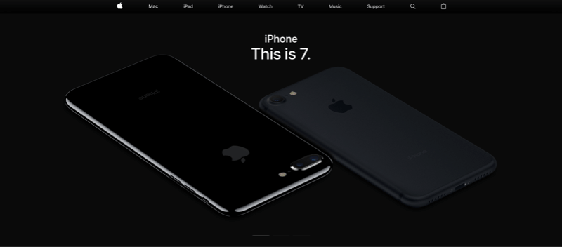
Still, rules are made to be broken. Apple.com uses a carousel on their home page. They do so in a way that uses a small number of different screens, which change slowly. Their hero carousel also stops animating once you interact with it and has navigation at the bottom.
A carousel can be useful for your hero header but be cautious. You don't want to confuse your visitors with too many messages.
Branding and navigation
With an eye catching headline, a clear and intruitive call to action, beautiful images and video, your hero header is looking pretty good. Don't forget your branding and navigation!
As we can see in the examples pictured above, it's common to place your logo in the top left and the menu on the top right. This is a convention and helps visitors know where to look for this information. Sometimes your call to action might be placed alongside the menu. If you do, it can be helpful to highlight it as a button to help it stand out as the most important action.
Make sure the logo and navigation links are easy to read. If using a large background image you might want to place a bar along the top to help the logo and links stand out.
Thinking beyond the "fold"
While it can be impressive to take over the screen with your hero header, it's also ok to let people know there's more to see below. People are pretty good at scrolling on the web and on mobile it's even easier than clicking. You can make use of this by having the content that follows your header be visible, encouraging people to scroll.
Still, studies do show that the information that people see first is more important than the rest of the page.
"What is visible on the page without requiring any action is what encourages us to scroll."
In short, make the most of what's visible when the page first appears, but also keep in mind that people do scroll. Even if they find that content less important.
Break the rules!
The approaches laid out here are hopefully useful but don't be afraid to try your own approach. A nice example is the landing page from BaseCamp. At first glimpse it seems a little chaotic. Their logo is in the middle. Their menu is split up on both sides and they have three headlines.
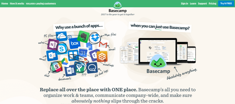
Still the header works in my opinion. It clearly shows the problem being solved, it has a highlighted call to action on the top right and the layout encourages people to scroll.
Animation
With an awesome hero header in place, something is missing. It's just loads and appears suddenly. The next step is to add in animation! Next we'll make your hero header animated.

Make sure to follow on Twitter for all the latest updates!