Star Wars
December 10, 2015
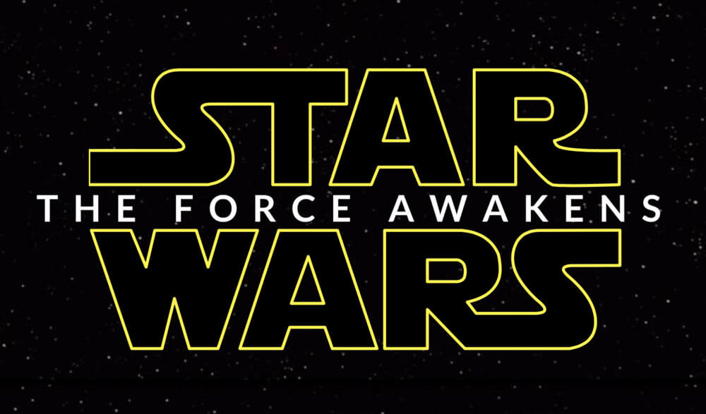
Get out the popcorn! Today we're building the Star Wars movie title from the "The Force Awakens" trailer.
This is an excerpt from the course, CSS Animation 101. For a limited time you can pay what you want. Check it out!
This example combines CSS animation with some other CSS properties you may find helpful, specifically the transforms scale, translate and rotate.
Transforms
While it may sound like it creates an animation, the transform property is in fact used setting a static position, skew or scale of an element. We can use it to create great effects but to do so we need to have a different transform for each keyframe or state we animate.
Transform: scale(), translateZ() and rotateY()
We can make elements larger or smaller using scale. Using translateZ we can move elements in the Z-axis. This axis would be the one represented by drawing a line from you, through the monitor.
In this case we'll be using a combination of scale and translateZ to make it look like some words are flying through space.
Lastly we'll use rotateY to spin the letters of the tagline. Rotating around the Y-axis will require a bit of 3D work in the browser.
SVG, HTML and CSS
In preparation for this example I made two SVG files for the Star and Wars parts of the logo. Do feel free to grab them to use if you want to play along.
The HTML for the demo is as follows:
<div class="starwars-demo">
  <img src="/images/star.svg" alt="Star" class="star">
  <img src="/images/wars.svg" alt="Wars" class="wars">
  <h2 class="byline" id="byline">The Force Awakens</h2>
</div>
A static image of some stars is used for the background. The font in the byline was tricky to find, so I've referenced the web font "Lato" in this example.
With some absolute positioning to center the content in the middle of the screen, we begin with this:
Animating the Star and Wars
We want the larger text to fade into view, while also starting larger and getting smaller over time. This is a good case for the scale() transform. Let's use it on the word "Star" with these keyframes:
@keyframes star {
  0% {
    opacity: 0;
    transform: scale(1.5) translateY(-0.75em);
  }
  20% {
    opacity: 1;
  }
  89% {
    opacity: 1;
    transform: scale(1);
  }
  100% {
    opacity: 0;
    transform: translateZ(-1000em);
  }
}
There are two properties that change over the course of this animation. The opacity and transform. The opacity change makes it start transparent, and fade away at the end so that we can loop the animation.
The transform begins by setting the scale at 1.5. This means that the initial size of the text is 150% larger than normal. At 89%, we set the transform property to a scale of 1. This means that between 0% and 89%, the scale goes from 150% to 100%.
The final transformZ causes the words to zoom away quickly.
We can apply these keyframes to the word "Star" like so:
.star {
  animation: star 10s ease-out infinite;
}
.wars {
  animation: wars 10s ease-out infinite;
}
The animation property here is specifying an animation called star, and a duration of ten seconds. It applies the built-in ease-out timing function, and tells it to repeat infinitely. We apply a similar rule for the word "Wars".
Making it 3D
Using 3D transforms in CSS, whether translating along the Z-axis, or rotating around the Y and Z axes requires that we set a stage for the 3D. In HTML terms this means we create a container, and tell the browser that some 3D stuff is going to happen.
We do this by adding the following to the .starwars-demo div:
.starwars-demo {
  perspective: 800px;
  transform-style: preserve3d;
}
These two properties tell the browser that the container's children should be positioned in 3D, rather than flat. CSS Tricks goes into more detail on the property.
Secondly, the persective property tells the browser how "deep" the scene needs to be. In case we've made it 800px. Smaller values create more "extreme" perspective effects as the scene is shorter.
With that covered, we'll introduce the tagline.
Awaken the Force
The tagline "The Force Awakens" appears in the trailer with each letter spinning into place. We can create this effect using the rotateY transform. In this case we've wrapped each of the letters in a span element, so that we can apply animation to each letter.
An issue I quickly discovered was that there isn't a straightforward way to animate each of the letters in the byline. My first approach was to manually wrap each letter in a span tag. This worked but made the HTML a little messy. The current demo includes some JavaScript (thanks to Tady for the assist) that wraps each letter automatically in a span.
We're going to apply an animation to each letter.
First, the keyframes:
@keyframes spin-letters {
  0%, 10% {
    opacity: 0;
    transform: rotateY(90deg);
  }
  30% {
    opacity: 1;
  }
  70%, 86% {
    transform: rotateY(0);
    opacity: 1;
  }
  95%, 100% {
    opacity: 0;
  }
}
To begin with, the letters are rotated 90 degrees, then by 70% through the animation, they've been animated to face the viewer.
We can apply this set of keyframes to each span like so:
.byline span {
  animation: spin-letters 10s linear infinite;
}
.byline {
  animation: move-byline 10s linear infinite;
}
The result is each of the span containers that hold each letter will fade and spin slowly into place, before fading away at the end of the animation.
Putting it together we have the finished demo.
This is an excerpt from the course, CSS Animation 101. For a limited time you can pay what you want. Check it out!

Make sure to follow on Twitter for all the latest updates!